introduction
During this lesson we had to create a narrative through a sequence of photographs following certain rules and guidelines that we were handed.
The rules were...
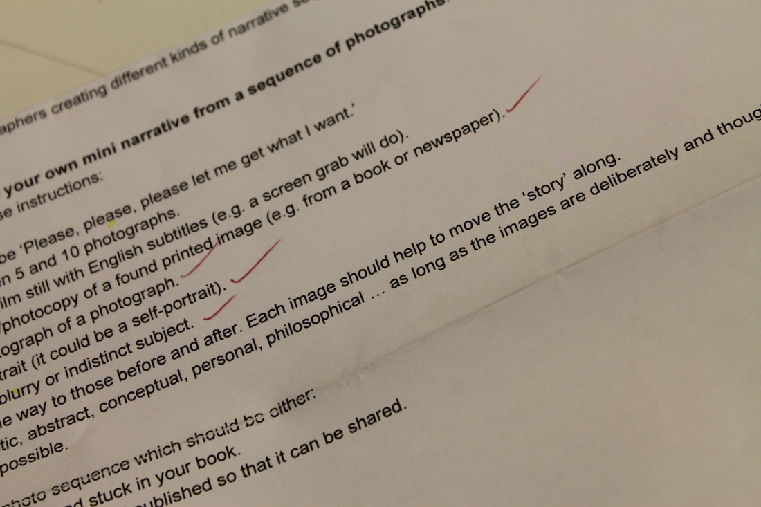
1. The title of your narrative sequence will be "Please, please, please let me get what I want.".
2. Your narrative should consist of between 5 and 10 photographs.
3. One of your photographs should be a film still with English subtitles (e.g. a screen grab will do).
4. One of your images should be a scan/ photocopy of a found printed image (e.g. a screen grab will do).
5. One of your images should be a photograph of a photograph.
6. One of your images should be a portrait (it could be a self portrait).
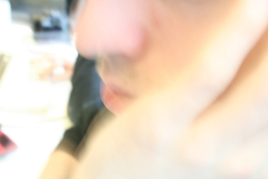
7. One of your images should be blurry or have an indistinct subject.
8. Each image should connect in some way to those before and after. Each image should help to move the "story" along.
9. Your "story" can be traditional, poetic, abstract, conceptual, personal... as long as the images are thoughtfully sequenced.
10. You should have as much fun as possible.
During this lesson we were testing our skills and being assessed on...
- Ability to work to a tight deadline.
- Idea generation.
- Tolerance of uncertainty.
- Willingness to take risks and work outside comfort zone.
- Focus/ concentration.
- Ability to work efficiently with a range of tools (e.g. cameras, phones, scanners, darkroom, photocopier etc).
The rules were...
1. The title of your narrative sequence will be "Please, please, please let me get what I want.".
2. Your narrative should consist of between 5 and 10 photographs.
3. One of your photographs should be a film still with English subtitles (e.g. a screen grab will do).
4. One of your images should be a scan/ photocopy of a found printed image (e.g. a screen grab will do).
5. One of your images should be a photograph of a photograph.
6. One of your images should be a portrait (it could be a self portrait).
7. One of your images should be blurry or have an indistinct subject.
8. Each image should connect in some way to those before and after. Each image should help to move the "story" along.
9. Your "story" can be traditional, poetic, abstract, conceptual, personal... as long as the images are thoughtfully sequenced.
10. You should have as much fun as possible.
During this lesson we were testing our skills and being assessed on...
- Ability to work to a tight deadline.
- Idea generation.
- Tolerance of uncertainty.
- Willingness to take risks and work outside comfort zone.
- Focus/ concentration.
- Ability to work efficiently with a range of tools (e.g. cameras, phones, scanners, darkroom, photocopier etc).
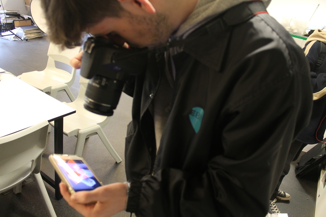
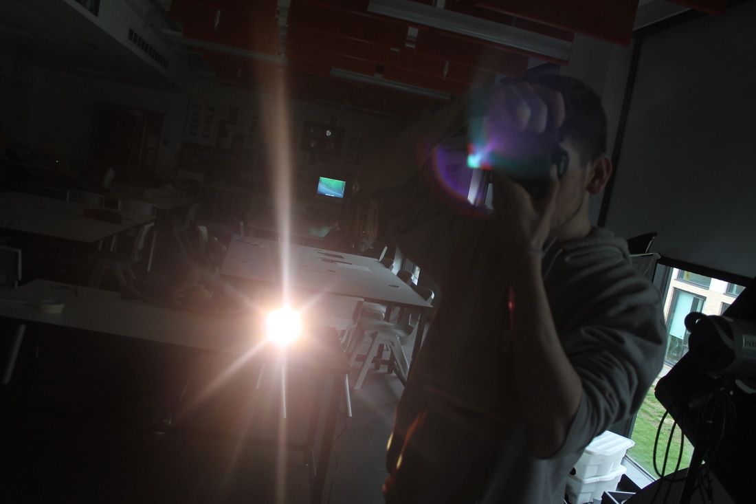
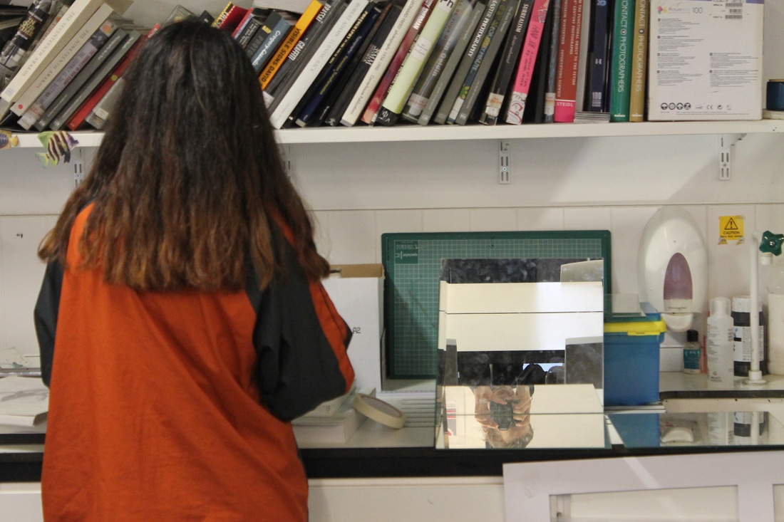
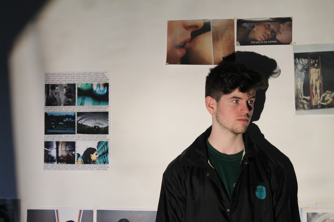
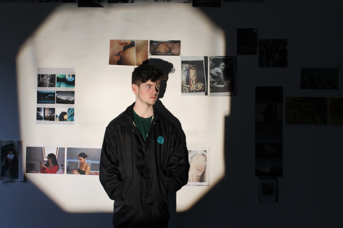
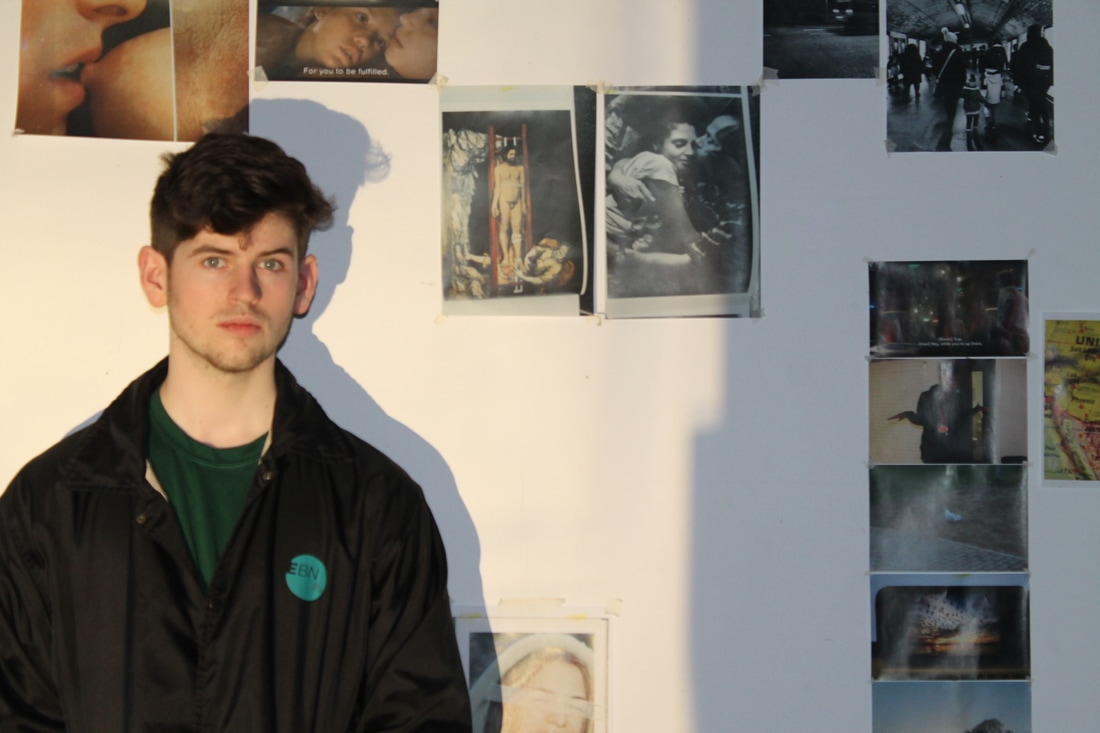
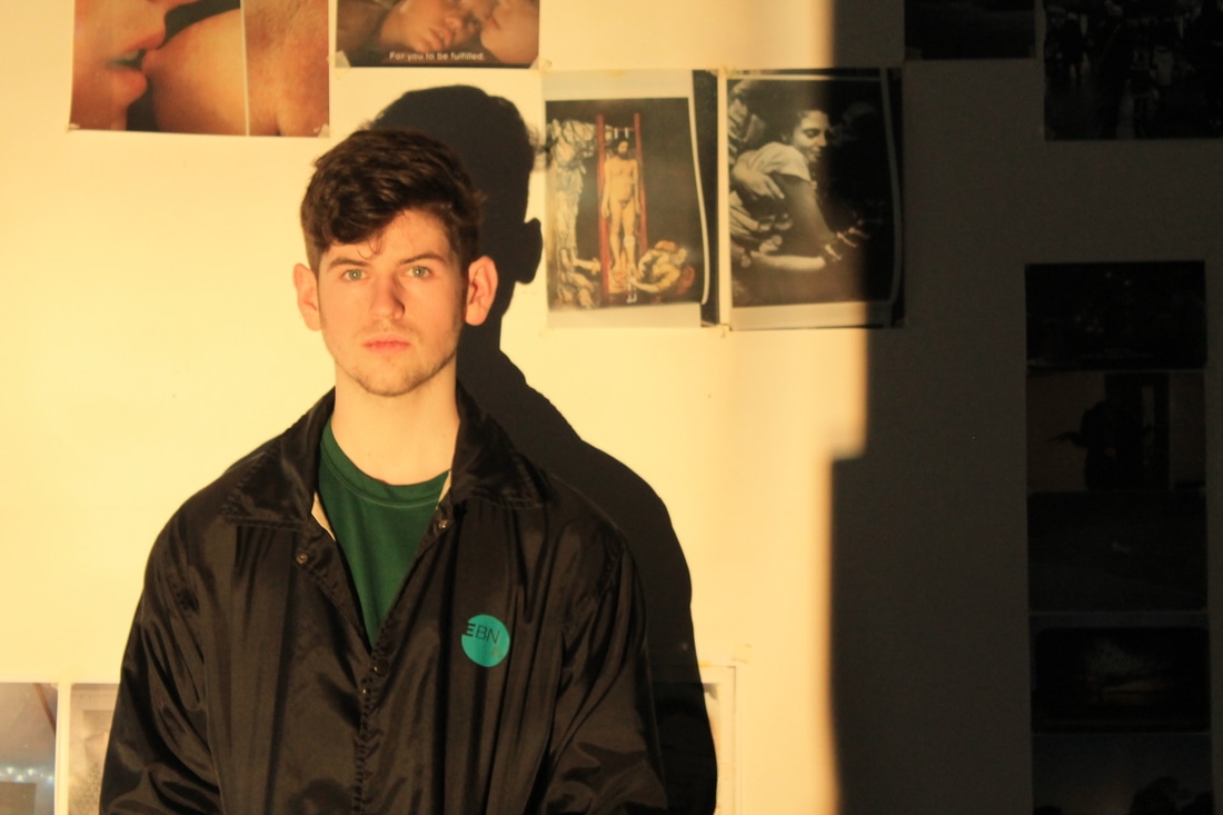
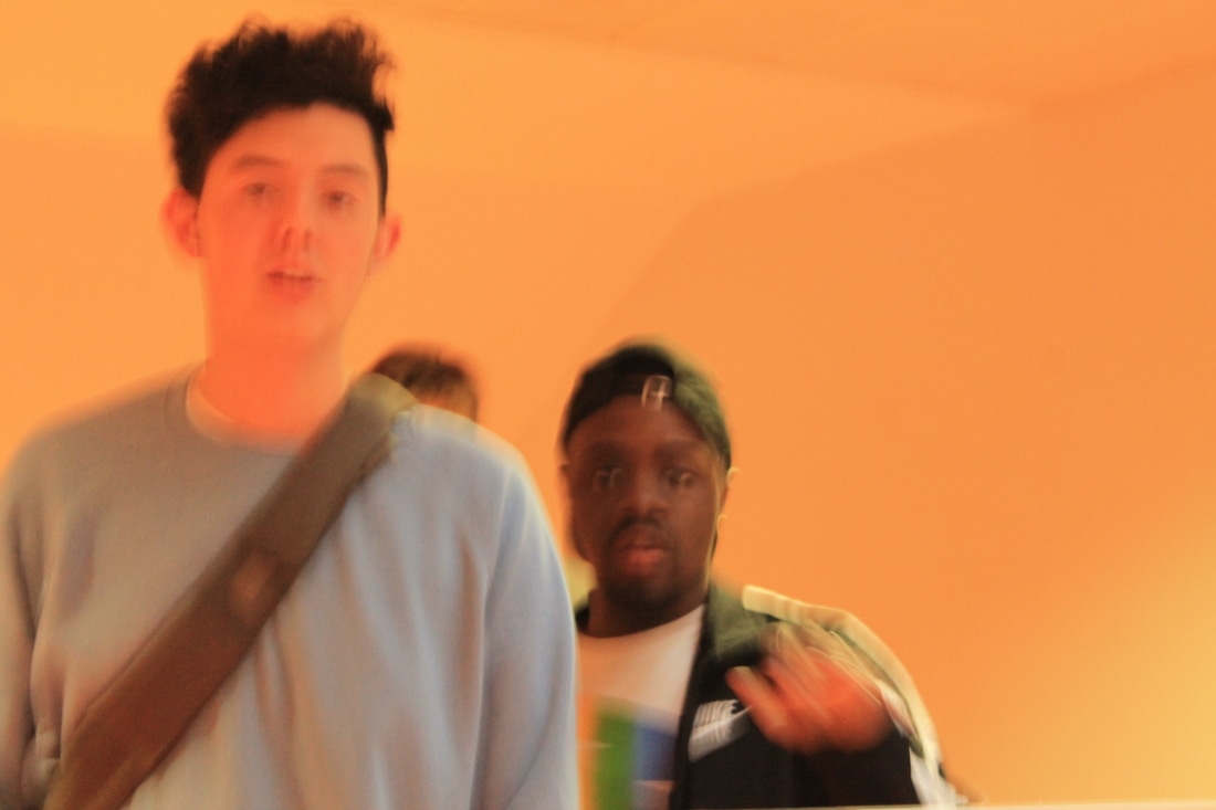
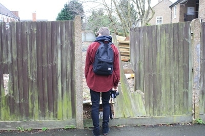
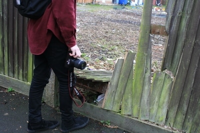
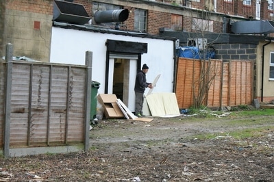
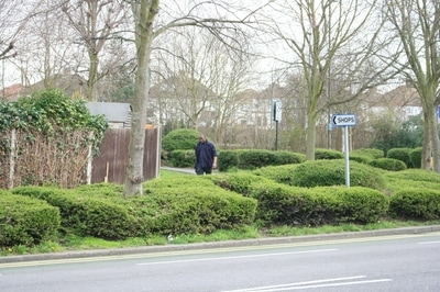
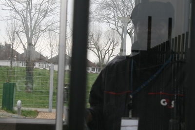
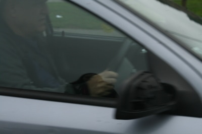
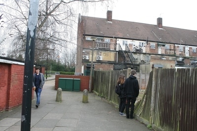
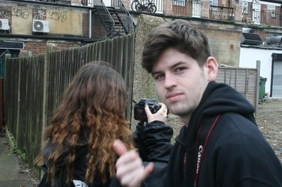
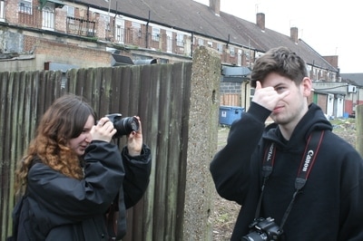
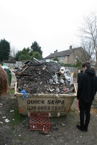
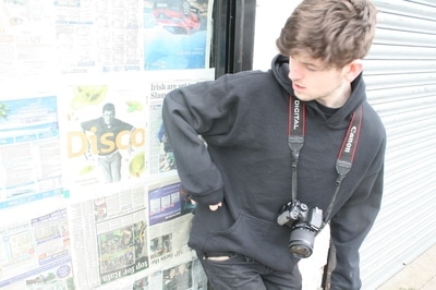
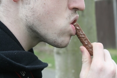
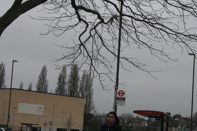
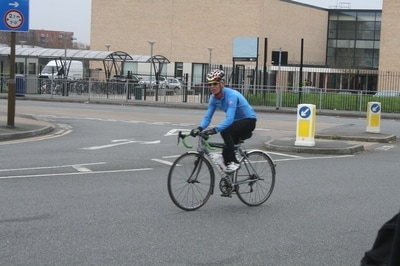
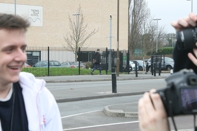
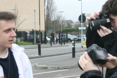
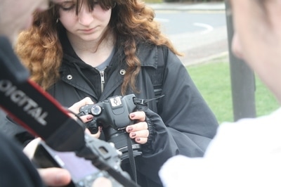
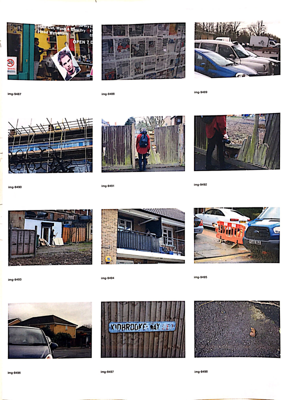
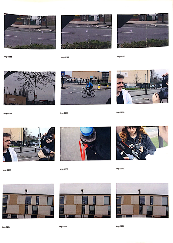
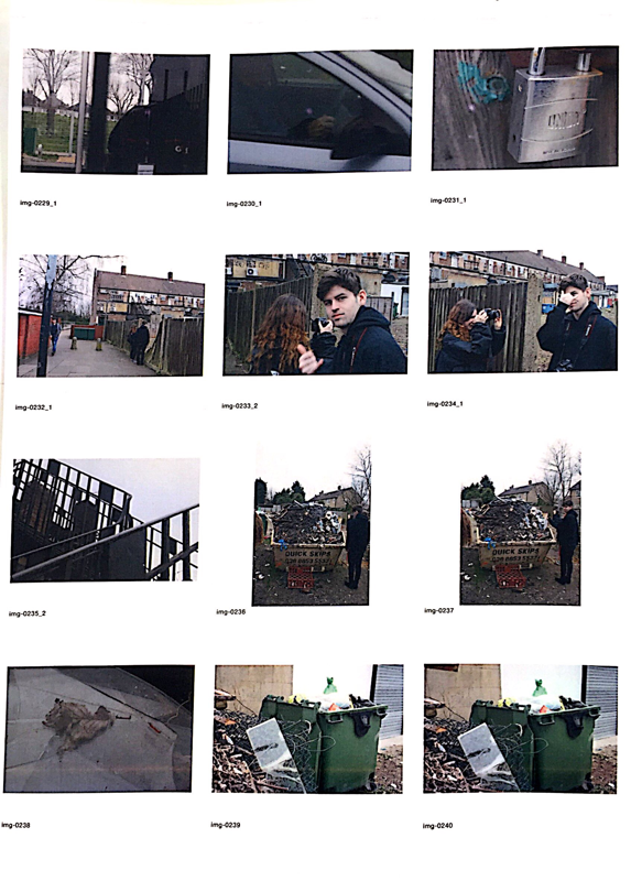
I decided early on that the narrative of my photos was going to follow the journey that my fellow classmate "Cian" was taking whilst trying to come up with an idea for his "please, please, please, let me get what I want" project because of this quite a few of my photos include him in them, and all of them play a part in projecting the things was up to, what he's like, and how his project was going.
duane MICHAEL'S
Michaels works are well known for using a certain sort of creative sequencing, where he places many photos which relate in some way next to each other in a way where the sequence tells a sort of story. He will often include some text to help look in to emotion and philosophy creating loads of little stories for us to view. The combination he uses of image and text really help illustrate the story and idea to the viewer in only a few photos which I think is really interesting.
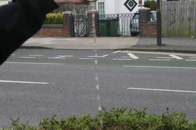
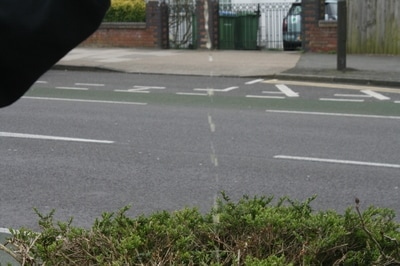
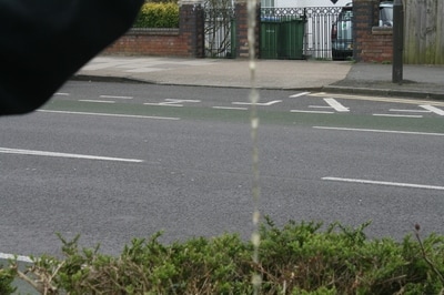
all of the photos i took
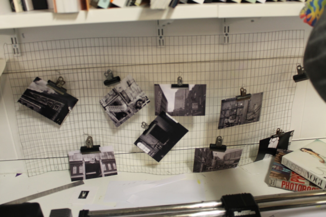
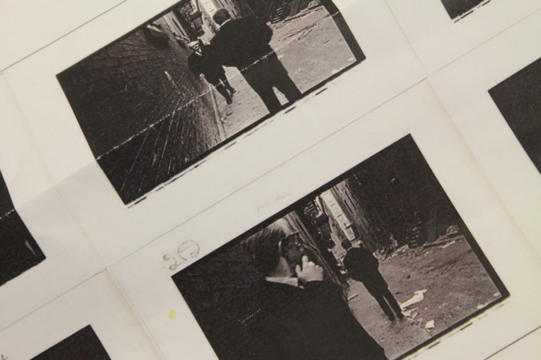
the images i ended up choosing

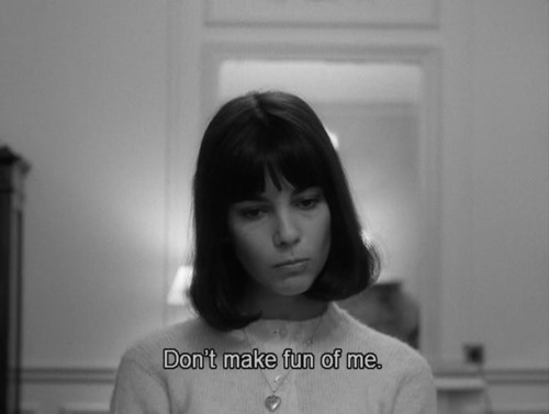


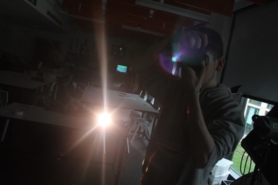
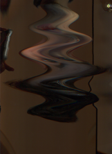
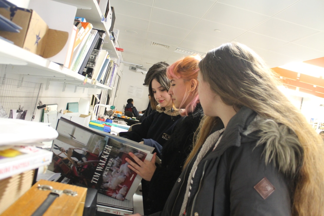
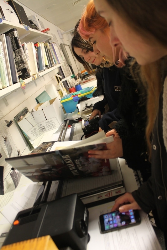
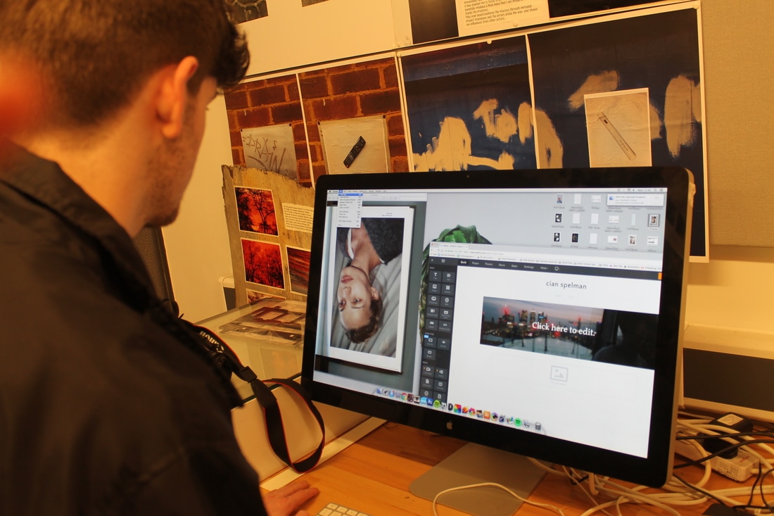
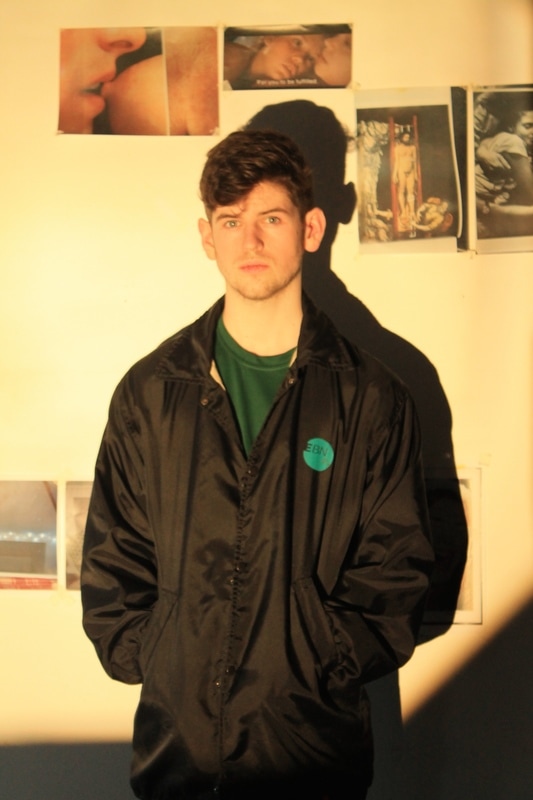
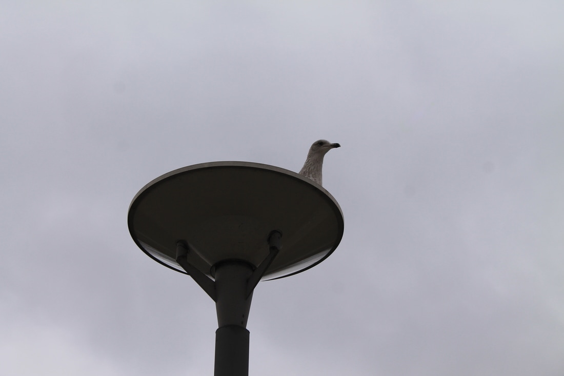
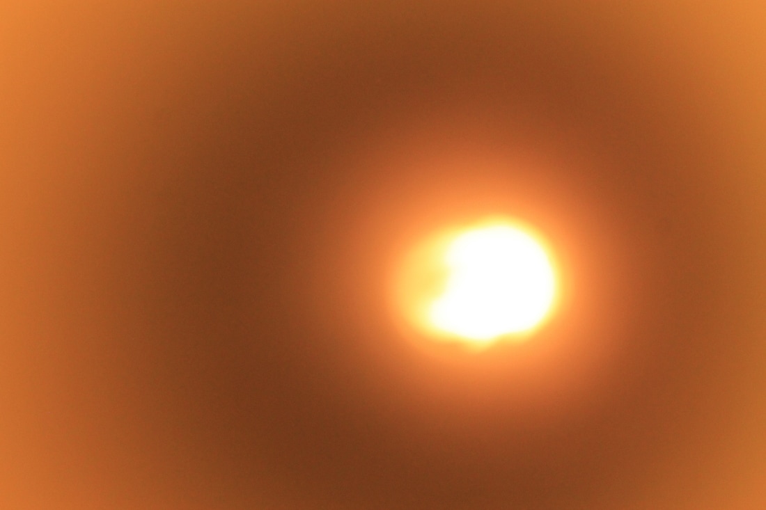
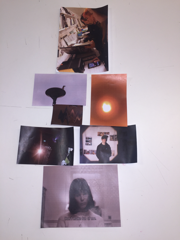
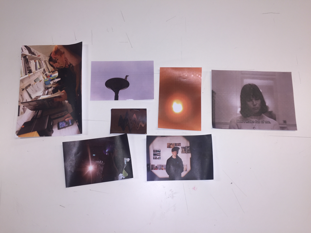
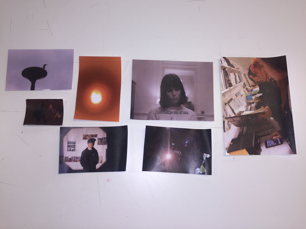
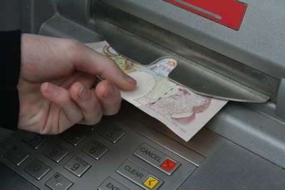
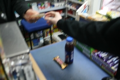
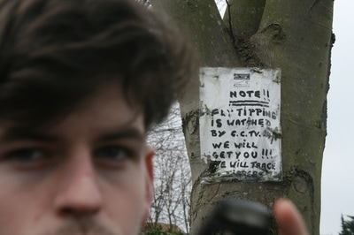
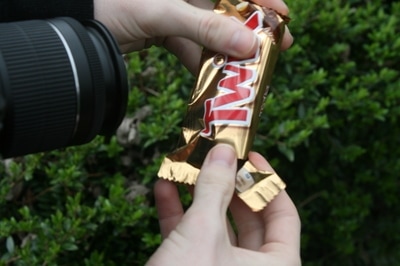
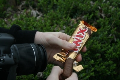
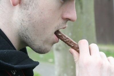
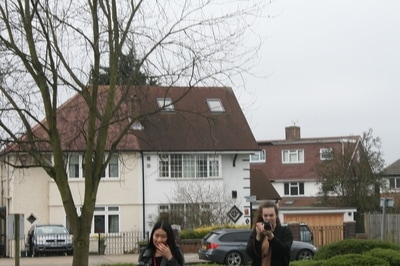
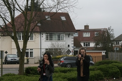
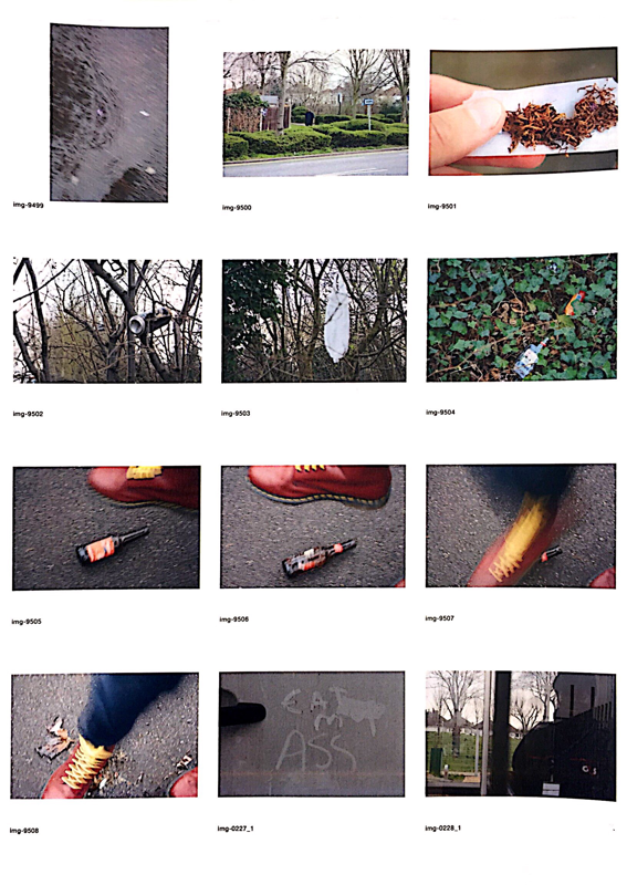
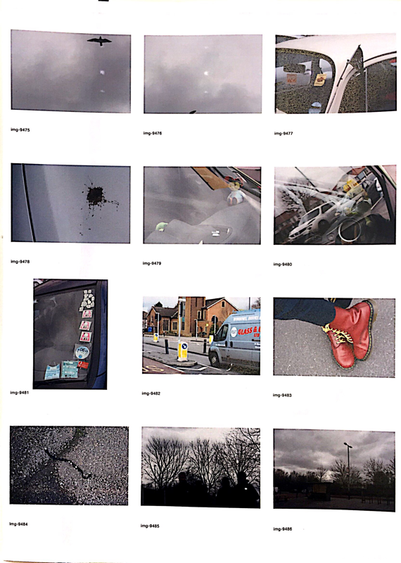
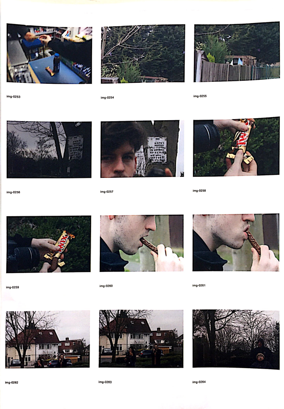
The image of the seagull relates to my story because me and Cian have a joke where if Cian was to be an animal he would be a seagull, and my story is about Cian and his journey, so I thought that this image would be appropriate as it relates directly to my relationship with him. The image of my group looking through photo books I chose because it almost signifies the beginning of our journey, especially since when the photo was taken no one had an idea for what their story would be about. I chose the "don't make fun of me" screen grab because a big part of me and Cian's friendship is having a laugh, and sometimes lightly making fun of each other. The photo of the light I like, and I added to my sequence because my journey is about Cian, and the light is almost very representative of life, and being alive, which I though really fit in with my sequence. The photo of Cian with the light shining on him I chose because it almost illustrates that the sequence is about him, almost like the light in the image is a stage light shining on him. The image of Cian taking a photo with the sense flare I chose because its showing Cian's interest in to artsy things and subjects such as photography which is the main interest shown in the image. And finally the last photo was actually taken on a scanner, to do this I had to get Cian to get right up close to in for him to appear, and to gain the weird wavy effect I had him move his head from left to right during the scan. I chose this photo because it really highlights Cian's upbeat, humorous personality, and its last in the sequence because its one of the more important photos that I want to have left an impression on the people that have seen it.
exhibiting my sequence
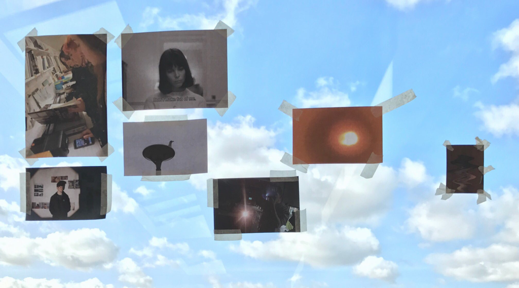
I chose to have my images put up on a window because I really like the way that the clouds and blue sky background compliment the images. I also think that it gives the sequence a sense of freedom, lightheartedness and ease like its not tied down, similar too how a good friendship should feel because I wanted to connote similar feeling to our friendship.
What kind of photographer am i?
|
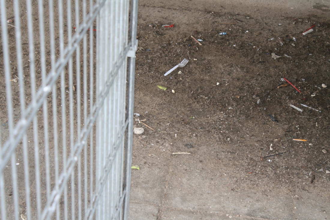
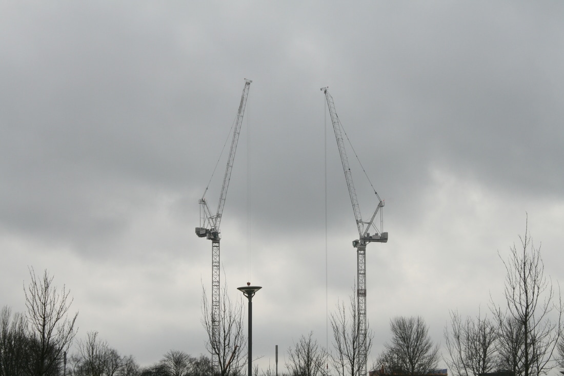
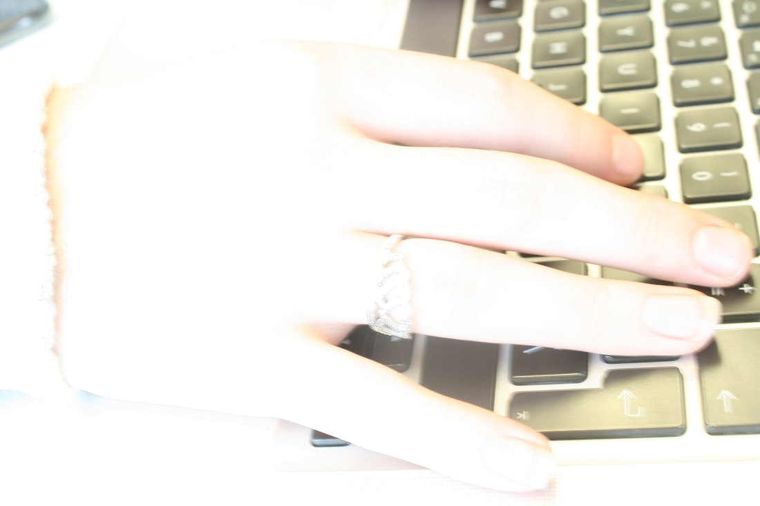
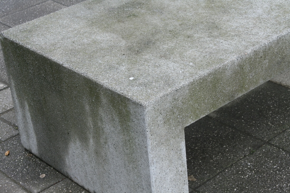
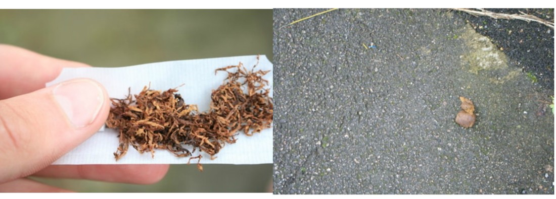
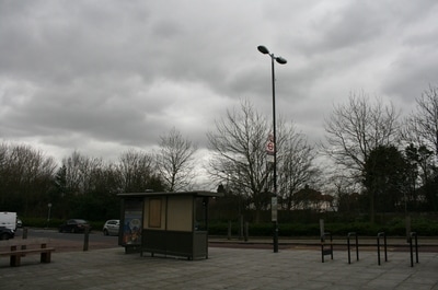
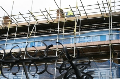
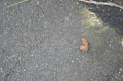
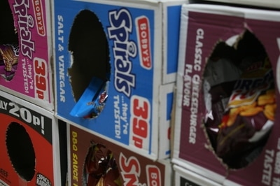
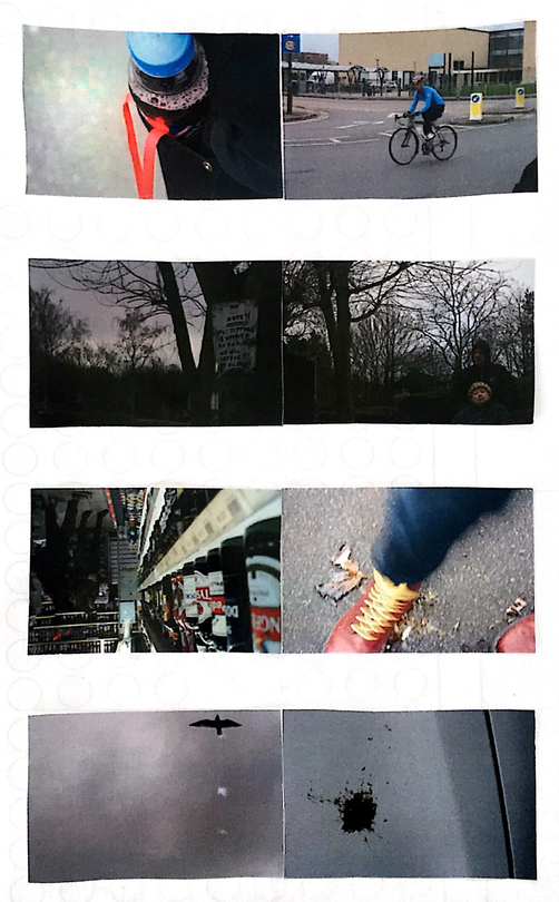
For this task we were given a list of subject matters for photos we would later have to take, and we had to chose 5-7 of these subjects which appealed to us, and that we would want to use. From my list I chose corruption, electricity, construction site, hands, concrete and lips. I chose these because I knew that they would be subjects that I would not get caught up on for long unnecessary amounts of time, that I knew were either close by or realistic to my location and that appealed to me. The first photo of the plastic fork in all of the dirt and grim was the photo that I took for corruption as to me things like litter and not being able to keep out planet clean in a sense is corrupting our world. and I also wanted to show corruption in a more outside of the box way, instead of jumping to something obvious like corrupt institutions (for example police). My second photo was for the subject "electricity", I like this photo because its not a photo of loads of wires, plugs and leads, it to me feels almost as if I've captured an image of actual electricity with the violent little red line seeming to jump across from the two points. The third photo that I took was for the subject matter of "construction site", and for this I was quite straight forward in actually taking a photo of a construction site, however, despite it has no real deeper meaning other than the fact its a construction site, I really like the photo, with all of the verticals from the cranes, lamp posts and trees. For my fourth photo the subject matter was hands, however I wanted to capture hands in a more interesting way which is why I chose this photo, with the bleached out, over exposed hand in contrast to the keyboard I think makes the photo work really well. The fifth photos subject matter was concrete, and I think I captured concrete really well here, as concrete is often associated with being big, bulky, grey and hard I think I captured all of this here. My sixth photo was for the subject matter lips, and I did the same thing that I did for hands here as I wanted to make the photo a bit more interesting this photo like the other is slightly bleached out and has some blur which I like as it adds some movement to the images.
|
|
all the photos that i took

contact sheets
creating diptychs
|
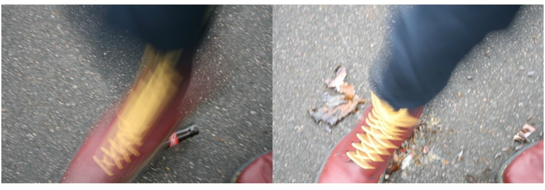
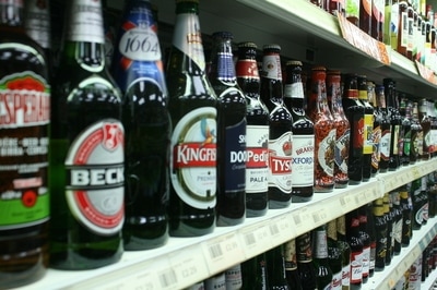
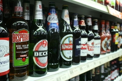
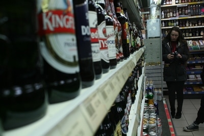
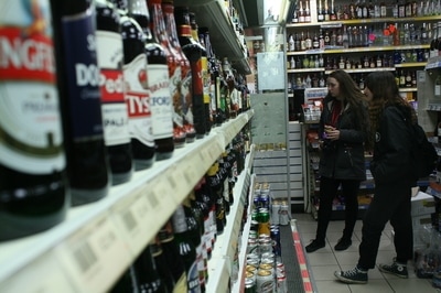
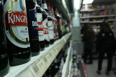
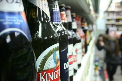
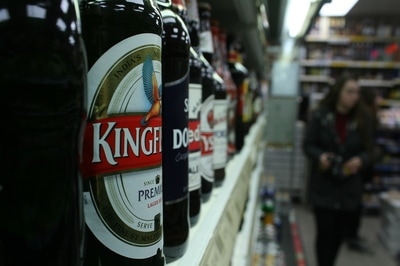
After playing around with all my photos and all of the possible diptychs these are the final ones that I ended up choosing for my final ones. I chose these ones because I will have thought they go together well either because they are similar or different, I believe that either will make a diptych work quite well, however since the sky was very grey all of my photos have the same sort of grey tint to them, so all of these were put together because of similarities. The top diptych I chose because of the two really bright blues in both photos standing out loads against their really grey dull coloured backgrounds, the red in the photo on the left also stands out like this but there is no red in the photo on the right which I like.
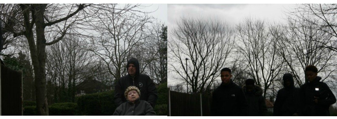
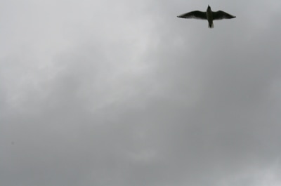
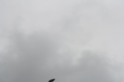
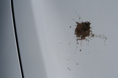
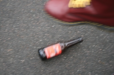
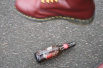
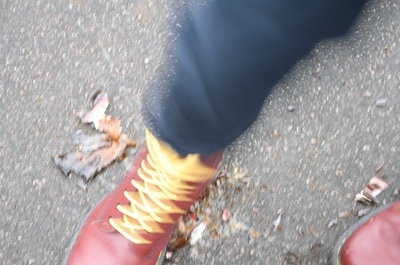
The second diptych from the top was chosen because I really liked both images include almost silhouetted trees, and the skyline and horizon match up with both making them almost seem like the same image, also both subjects matters in the photos (the sign and the old lady) are to the left on each image which I think looks really nice. The third diptych I put together for many reasons, the first beinf the obvious colour match with the red of the shoe and the red beer bottle labels. The subject matter of both photos also relate to each other, as in the first image there are multiple beer bottles, and in the other, is a beer bottle getting smashed. I also turned the first image upside down because I personally think that it makes the image and diptych much more interesting as you almost have to think what the photo is of as it makes it look quite surreal. The last diptych was put together because of the obvious dull, flat grey colour match that I think works well, the second is because of subject matter, the first image is of a bird flying in the sky, and the second is of a splatter of bird poo on a car bonnet, which I think really links the two images well to make them work. |
