|
To the left is a a summary of the Photopedagogy threshold concepts and I chose this one "Photographs are abstractions shaped by technology" because as a photographer I do obviously prefer a certain theme and style when it comes to the photography that I like to create and work with. I like to include many little abstractions to my images whilst in the process of taking the shot so that not much if anything ever needs to be done in post production. I do this because it makes the images more fun and challenging to capture, whilst preserving a sort of authentic, special quality since that in the modern world technology has made it so that you can change, alter and create any image you want only through photoshop without really even having to take an actual photo yourself. I like to create the abstractions in my work by interacting with the way that I am taking the image, whilst capturing it, for example strange angles, unusual lighting, blur and even weird subject matter etc. however despite doing these things and more in an extremely unconventional way, I do still prefer to use things like good composition, rule of thirds, good range of tones and sense of depth etc in my work in together with the abstractions to create what I think is a visually aesthetically pleasing (because of the composition) and interesting (because of the abstractions) image too look at and interact with.
|
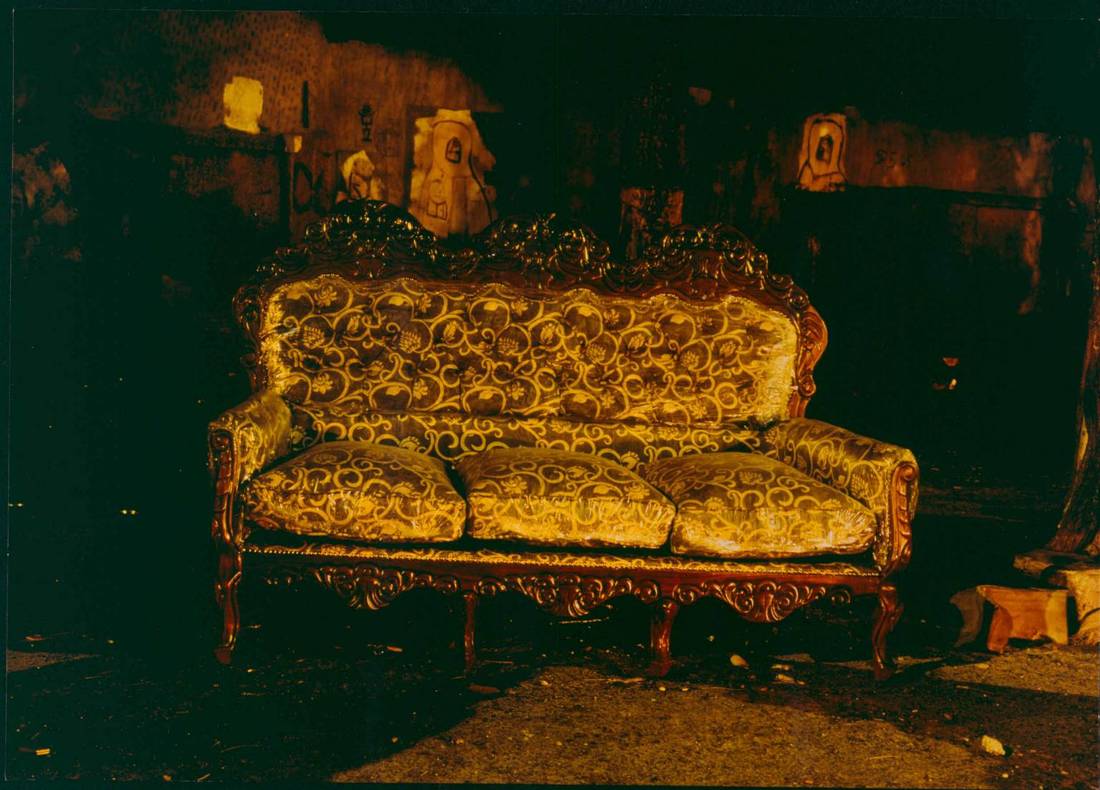
tom hunter
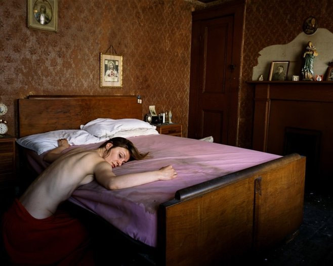
LIGHT
The light in this image looks natural as it is soft and gentle, it looks as if the light is coming through from a window of to the right of the image. The light falls in to the centre of the image however it does not fall entirely on to the images subject matter (which is the girl laying on the bed), she seems to be nearer to the dark side of the room as opposed to being directly in the light from the window. Apart from the bed, back wall and parts of the woman the image seems actually quite dark, three of the images corners are actually very dark and it becomes hard to see in detail what resides on the floor or where her legs are. The wide range of tone in the image from dark to light makes it feel very real and adds a lot of depth to the image as a whole, especially because of the dark and light tones on her back.
FRAMING
The image to me is framed quite strangely and unconventionally. There are objects and things in the image which have been half cut out of frame only by a slight amount to where the photographer could have easily moved backwards to capture the rooms entirety which I find different. For example the bedside clock, picture frame, mirror/ mantlepiece and the woman herself are all slightly cut out of the image. The woman is also not in the centre and is instead more towards the left of the image, this may have been done on purpose to try and highlight the other features around the room (religious symbols, dirty bed etc) and try to make them the main subject matter instead of the woman. The framing of this image does no make any one thing massively stand out, however the woman and the state of the room she is in seem to be the main focuses.
SPACE
Despite the woman drawing in my eye the most in this image, she actually only takes up a very small amount of the space, and her whole self is not even completely in the image either as her lower half is completely lost in the images dark floor and edges. The image in its self is actually extremely empty, with most of the available space being taken up by the big plain wall and dirty lifeless bed. as a result the photo feels very empty and lifeless which is only enhanced by the photos subject matter. The fact that the woman is on her own, not moving and lifeless looking in a room where everything
also looks lifeless, the empty bland walls, dirty bed and religious feel that creates an almost tied down, trapped and strict feel.
COMPOSITION
The composition of this image is also quite unconventional and strange. The woman in the image is completely off centre towards the bottom left and her whole body is not even in shot as her lower half hides in the dark at the bottom of the image under the bed. There are also quite a few other things that are cut off out of frame because of the composition. For example the bedside clock, the picture frame on the wall, the woman and the mantle piece are all cut off to a point where the only objects completely in frame are one picture on the back wall, the objects on the mantlepiece and the doorway which is unusual for an image with actually quite a few objects within it. There is also nothing in the centre of the image apart from the old peeling wall paper which is quite big and takes up majority of the space in the image.
FOCUS
There is nothing too special to say about the focus in this image, the whole image seems to be evenly in focus with nothing really coming too close or far away for there to really be any blur, however having the whole thing in focus to me makes the image lose a sense of depth or interest despite the tones being created by the light in the window. The photo in the sense of focus is extremely conventional which too adds to the images strict rigid feel.
COLOUR
The colours in this image are all quite soft, and this effect is only enhanced by the natural light shining through the window on to the bed. The brownish sort of red wall paper with the extremely light purple really make the image seem soft, however this effect is almost completely contrasted by the images cold, almost hard subject matter which makes for a confusing, sort of interesting feel thats kind of unusual and fascinating.
peter fraser
|
Frasers photography is all largely influenced and created around the idea that "There is no hierarchical relationship between large and small, as everything in the Universe is made of small things" which was a concept that he found interest in from a young age from watching a small film "Powers of Ten". He also bought a camera at a young age and started to experiment with with things like colour and light (around the same time as other now well known photographers like Martin Parr and Paul Graham). Fraser gained inspiration to continue working and further developing his colourful photographic style in 1984 when he travelled to spend time with William Eggleston in the USA to gain experience. From this experience Fraser also started to include references to a more 'Poetic Truth' instead of a more factual 'Documentary Truth' which meant that at the time Fraser was going against the grain as British photography was mainly 'Documentary' based.
|
|
After his experiences with Eggleston, Fraser moved on to creating 4 of his own exhibitions 'Twelve Day Journey' 'The Valleys Project' 'Everyday Icons' and 'Towards an Absolute Zero'. The success that he gained through creating these exhibitions soon later aloud him to publish his first photo book publication in 1988 called "Two Blue Buckets". This book gained a lot of success and won the Bill Brandt Award hosted by the 'Photographers Gallery' a year later in 1989 which meant that Fraser gained a much more global audience for his work so he gained a lot of publicity from this.
Powers of ten- Video that inspired peter fraser
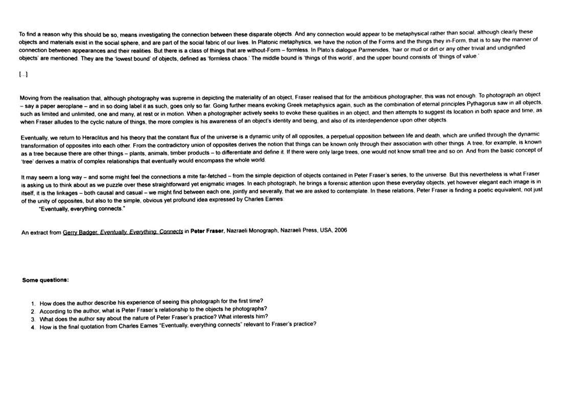
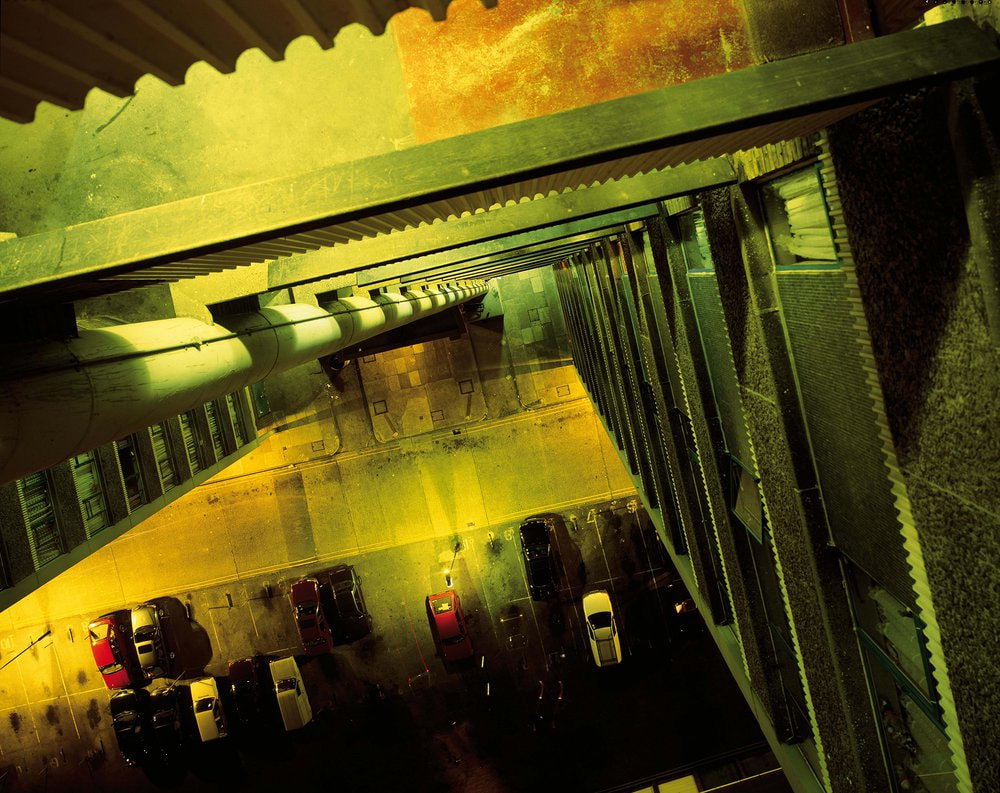
peter farser image analysis (two blue trucks)
- What can you see in this photograph? - I see a space between two large blue objects, theres a lot of darkness and its hard to tell what the image is actually off.
- What type of photograph is this? - I think that this image is actually very abstract. I think this because the image is quite unusual in light, colour, framing etc. And again its hard to tell what the objects in the image actually are.
- How is space described? - The space in this image seems almost eerie, as if the space between the objects is never ending and dark. The image almost feels claustrophobic in a sense with the feeling of being stuck between the two walls emerging whilst considering this photograph.
- How has the photographer dealt with light and colour? - The light in this image is defiantly from a flash on the camera, you can tell as the gap get darker further away and a lot lighter closer to the camera. And the colour of this image is extremely predominantly blue in an almost mysterious enchanting way similar to a deep sea blue, at first glance the image could almost have been taken under water.
- What is surprising/unusual/mysterious about this image?- I find it really mysterious thinking what the image is actually of, for me it almost looks like he pointed the camera down the middle of two great blue ships docked next to each other, despite the fact that I already know its of two blue trucks it still doesn't hold that resemblance because of the way the image was captured.
- Does this photograph remind you of any others? - The rich blue of the image is almost reminiscent of Ilean Quinlan's works along with its abstract mirrored feel.
- How does this image make you feel? - This image makes me feel like before I knew they were trucks all I wanted to do was find out what the image is actually of, why he chose to shoot it like this, the image really made me want to think.
favourite fraser images
These images are my favourite out of what I could find on the internet for many reasons. I weakly love the use of colour in these images, all the colours are really bold and stand out making the image come to life. I also really like the subject matter of these images, the simplicity of them mixed with the amazing vibrant colours just makes the images for me really visually pleasing.
my first experimental response to frasers images

The weather that I went out and took images as a response to Peter Frasers work in was actually quite clouded over and grey, meaning that unfortunately some of the images look quite flat and grey, however I thought that this might also play in to Fraser's extremely simplistic, blunt photography style, which I think worked for some of the images. I tried to look out for little things to take photographs inside of or to zoom in to to create the almost claustrophobic, close up feel that can appear in some of his images. I also tried to keep it simple, not including much of a background behind the subject matter to lessen a sense of depth, I would also use the flash on the camera to aid to this effect, that is unless a big sense of depth plays ion to the subject matter like Fraser's image ''in-between two blue trucks', from the Hirwaen, South Wales 'The Valleys Project''. I did find it somewhat challenging to find everyday objects and make them interesting through my lens, especially since most of the images I like to take are of people. Despite all of this I did have fun, and I think that I did achieve some nice images.
perter fraser visit
|
The short film on the right is the film of which Peter Fraser opened up his talk to us with, he talked about being a young 15 year old boy in school in Cardiff watching this video, and having it completely inspire him, change his life and help him to realise that he needed to be a photographer.
|
|
question I asked peter fraser
For someone starting off in photography how often would you suggest keeping a camera on them to take images?- It seemed that Fraser thought that it was vital to carry around a camera on you as much as possible so that you never miss a moment or an opportunity as long as you can help it. He also stated the importance of taking loads of images and never throwing any away as he told a story of some of his oldest works selling for £40,000 because of the good condition he had kept them in.
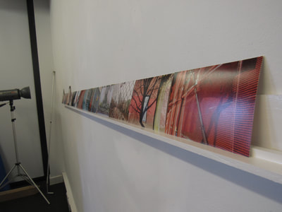
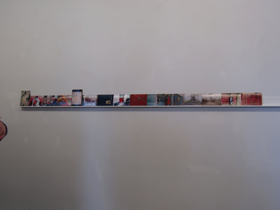
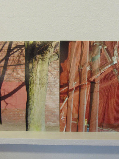
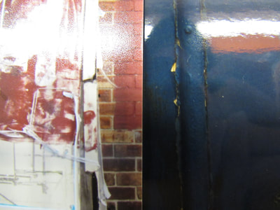
image pairing
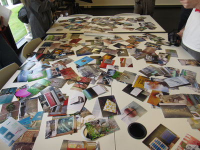
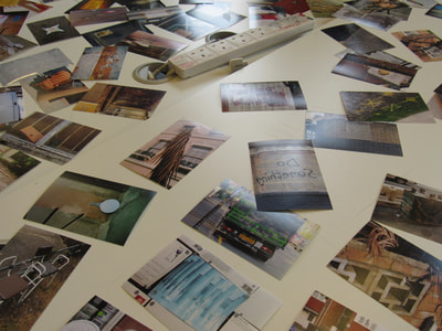
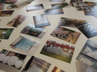
in this task we were teamed up with a partner that we would not usually work with and told to select 5 images from a variety each, and then choose between our images which ones are suited better together for a 5 image sequence. We had to chose the images from a large variety of photos all of the same style and theme, kind of still life, street photography.
|
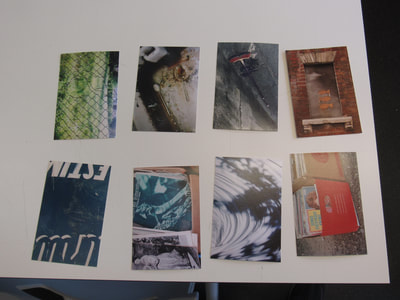
this is the final sequence that we chose. we chose this sequence largely for the similarities that they have in colour, blur and red being extremely dominant throughout the sequence. Texture within the image also played a large roll in the selection. The order we put them in was chosen so that not too much of one colour was in one area, we wanted to split it up evenly and have a nice gradient between the two dominant colours.
|
|
The untitled image stands out more than any other in the book. Imagine turning onto the page as being like turning off a motorway onto a small country road, the feeling, tone and atmosphere of the image is almost completely contrasted to most of the rest of the book. Goldin's famous in your face, I don't care, gritty style of photography is lost in this image as it's almost like she chose this to represent some, or many of the consequences that followed the lifestyle she led. The photo has a lingering eerie, ghostly feel to it which I can't manage to shake.
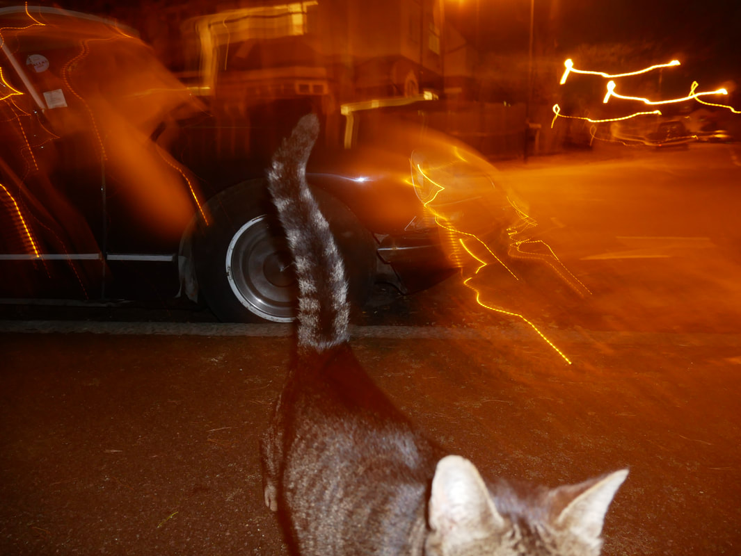
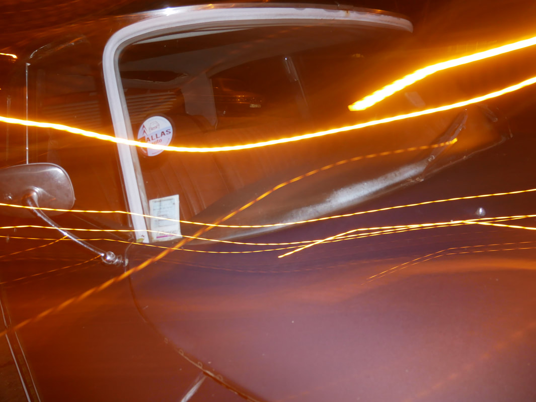
rut blees luxemburg
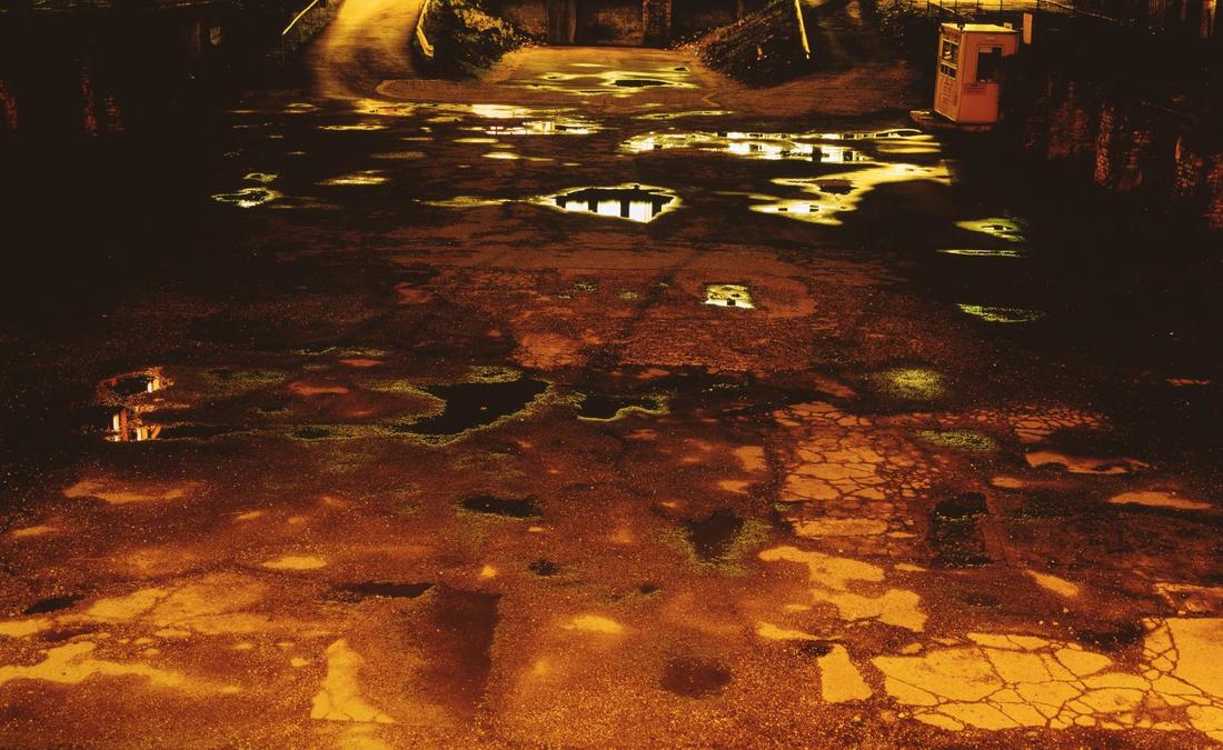
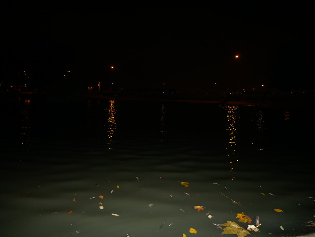
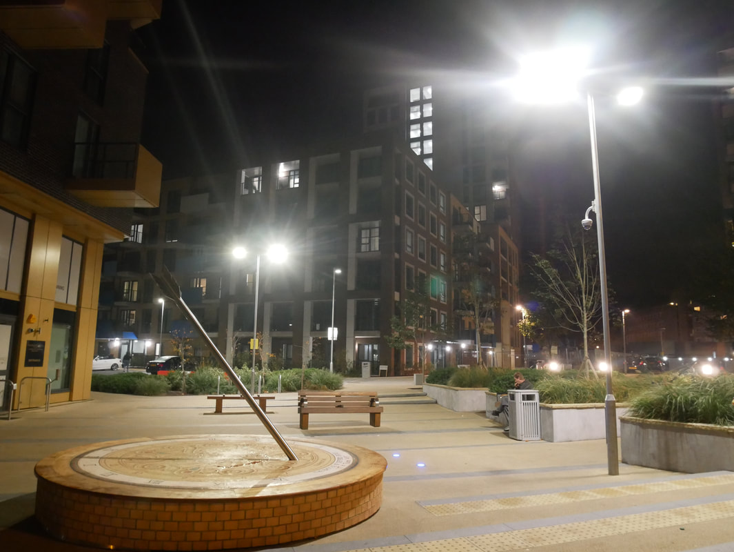
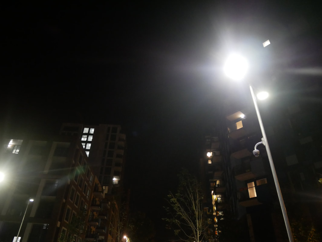
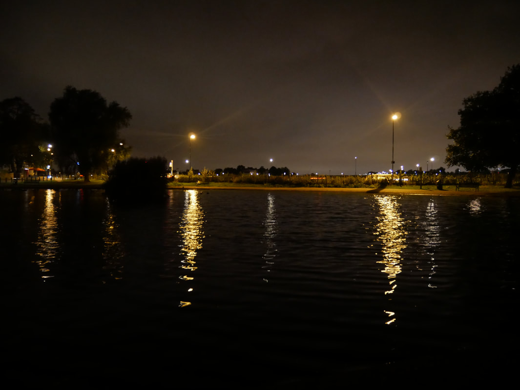
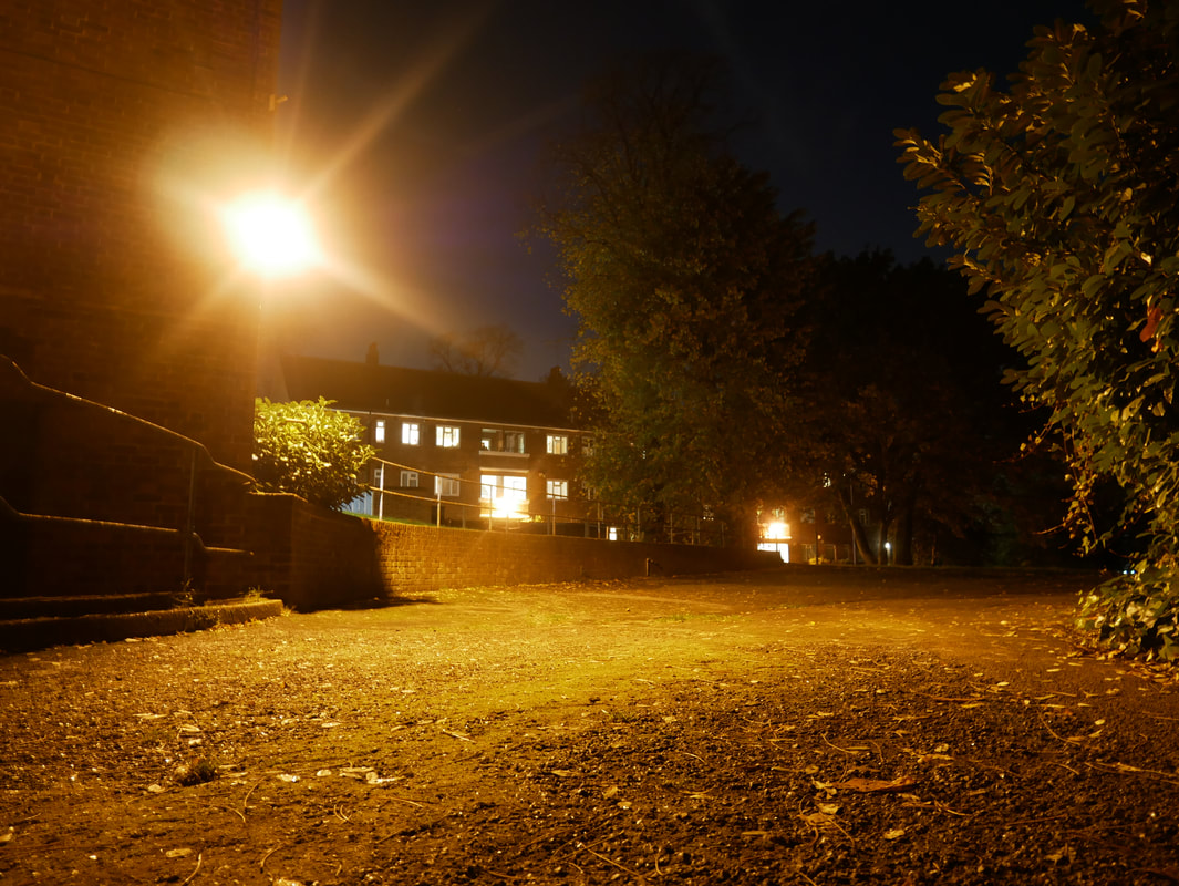
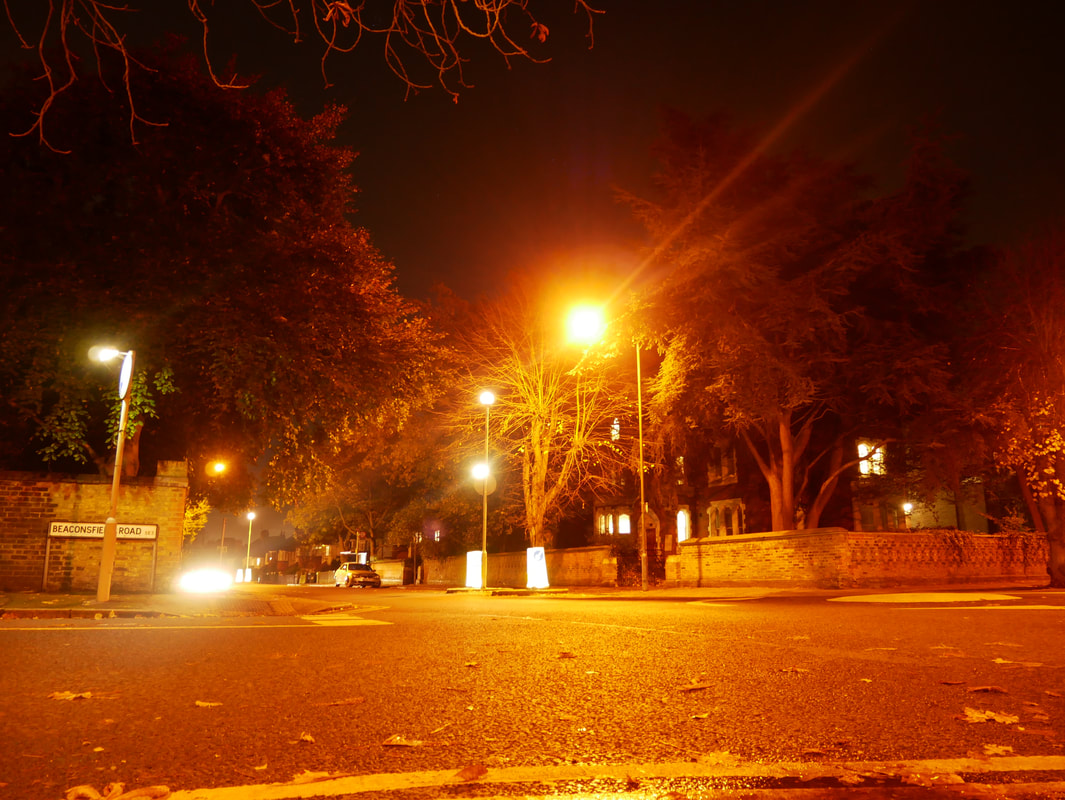
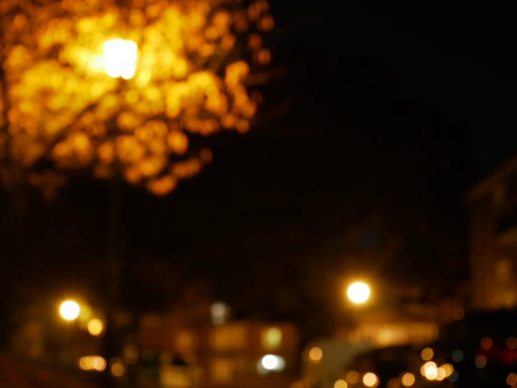
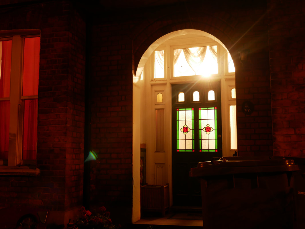
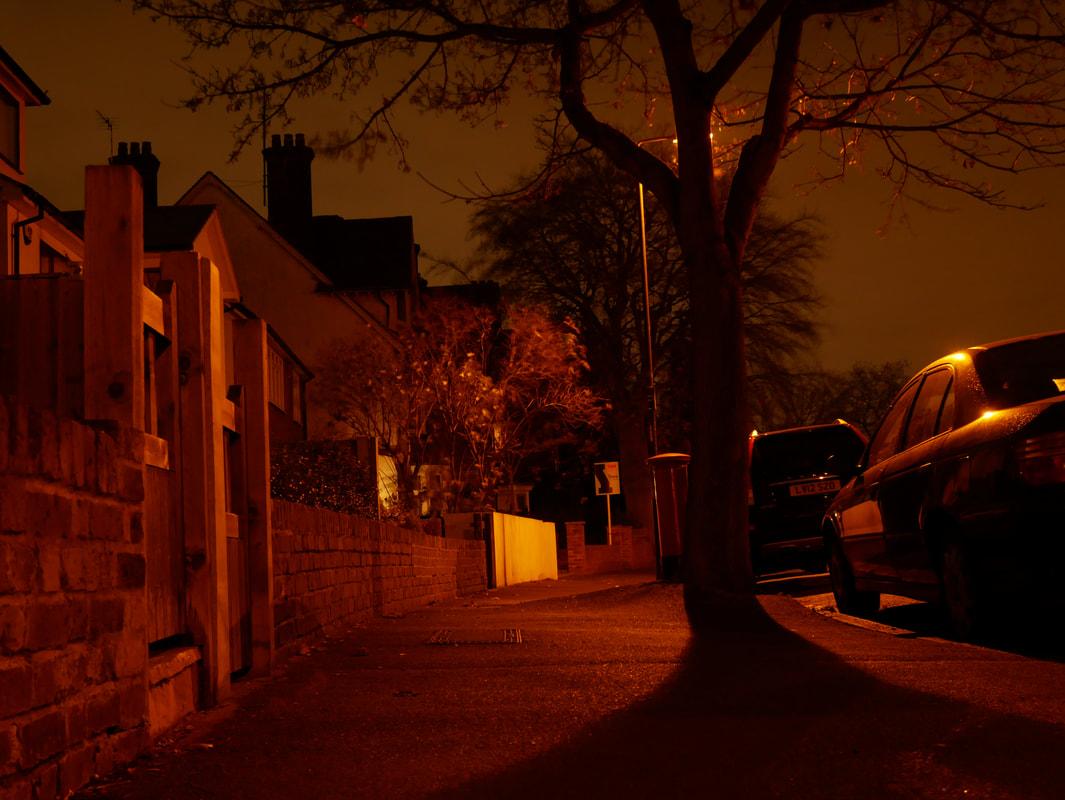
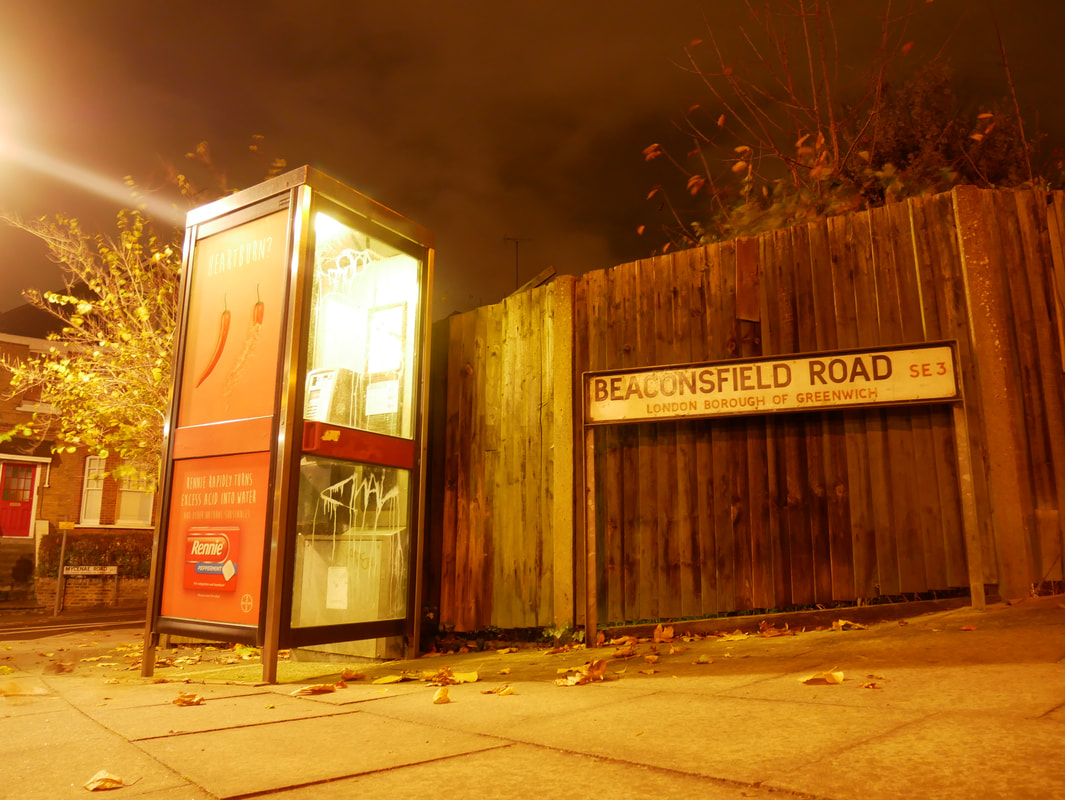
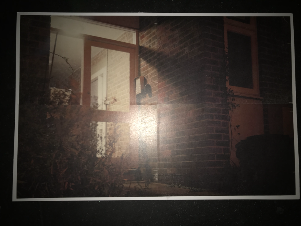
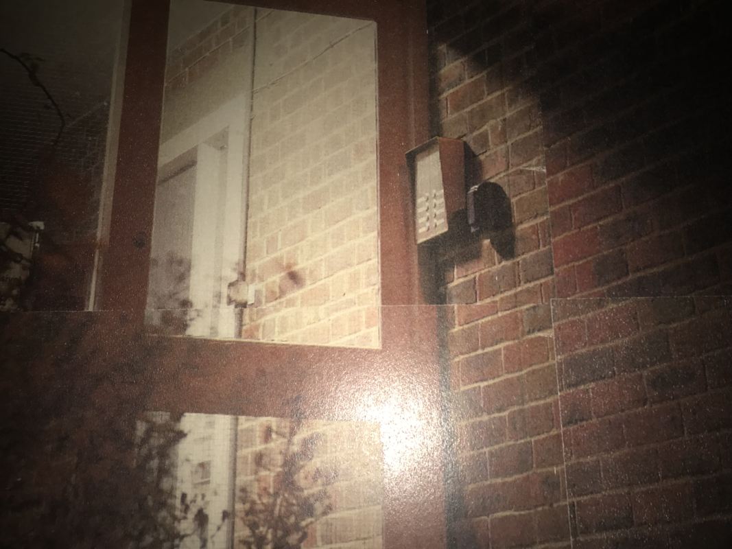
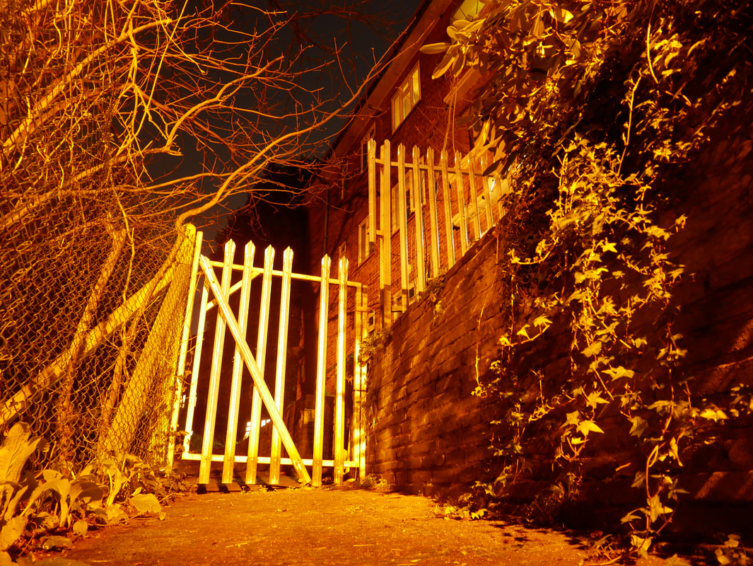
Continuing with my personal investigation, I will be looking in too a photographer called Rut Blees Luxemburg. I will be looking in too her because of the way that she only takes images at night time, with artificial sources of light to illuminate her image, which is very similar to what I will be looking in to for my personal investigation as I am looking in to images taken at night time. I also really enjoy the images that she produces and the style which she uses.
She exclusively likes to take images at night because of how it can make them look really strange, almost like there is a strong filter or colour hue to it. She creates this effect by experimenting with the cameras settings to change the aperture and shutter speed, She will typically lower the aperture and increase the shutter speed for shooting in the low light situations in which she thrives. This effect can make the images look really un-natural and almost uncomfortable because of the way that you would not expect to see the outside world like this in real life. I think that this gives a feel of the image being a little bit abstract, even though its not as bold and obvious as some other photographers. She also really only takes her images in an urban landscape. This is probably because of all of the available artificial lights at her disposal (i.e. street lamps, car headlights etc) which I think is a cleaver idea. And because urban landscapes are well photographed places, taking her images at night and in the abstract way that she does gives a new way, and perspective on these areas.
She exclusively likes to take images at night because of how it can make them look really strange, almost like there is a strong filter or colour hue to it. She creates this effect by experimenting with the cameras settings to change the aperture and shutter speed, She will typically lower the aperture and increase the shutter speed for shooting in the low light situations in which she thrives. This effect can make the images look really un-natural and almost uncomfortable because of the way that you would not expect to see the outside world like this in real life. I think that this gives a feel of the image being a little bit abstract, even though its not as bold and obvious as some other photographers. She also really only takes her images in an urban landscape. This is probably because of all of the available artificial lights at her disposal (i.e. street lamps, car headlights etc) which I think is a cleaver idea. And because urban landscapes are well photographed places, taking her images at night and in the abstract way that she does gives a new way, and perspective on these areas.
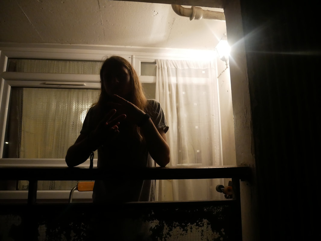
My response to Rut blees luxemburg
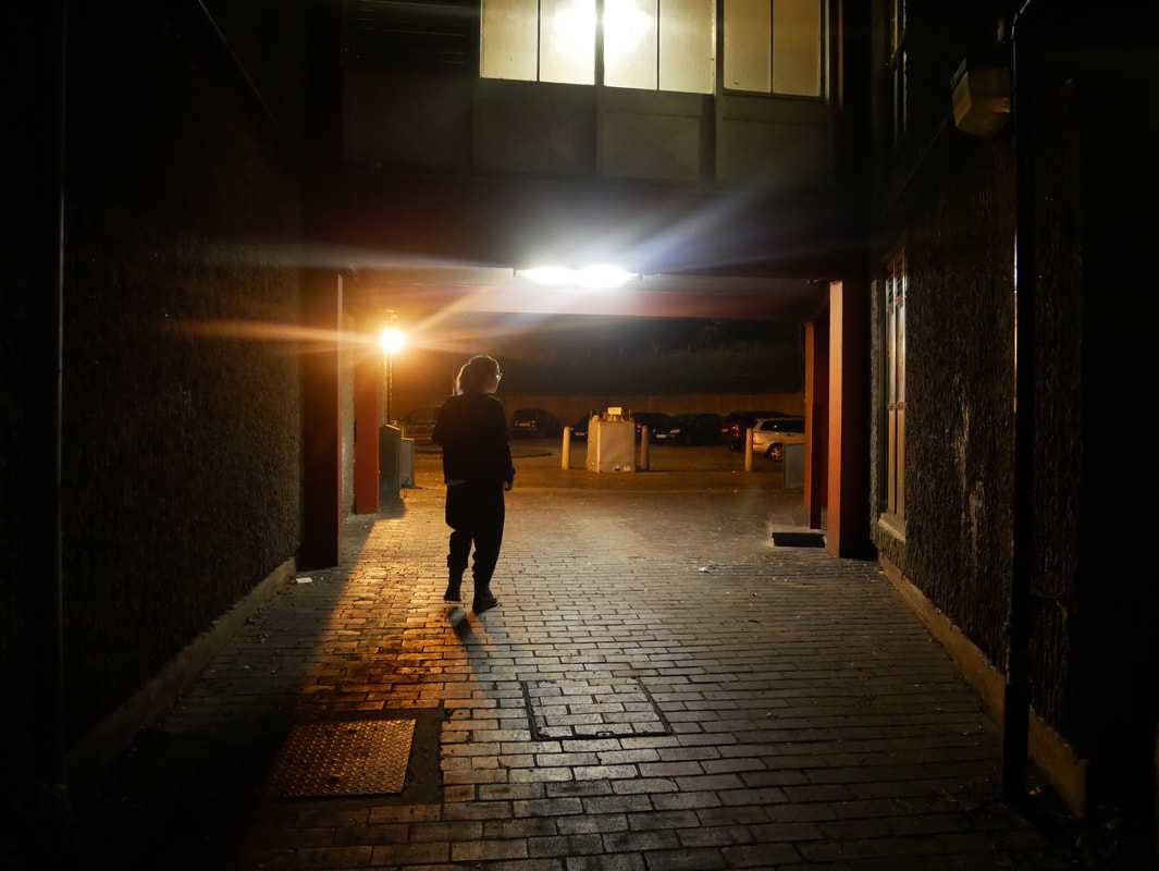
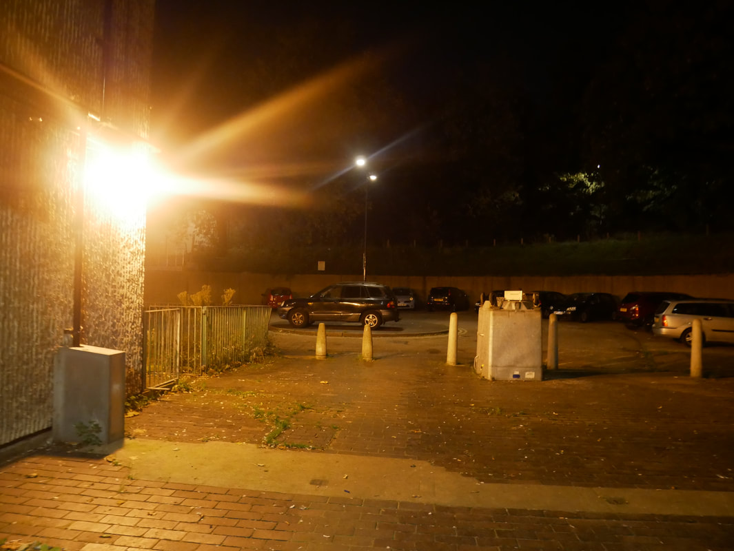
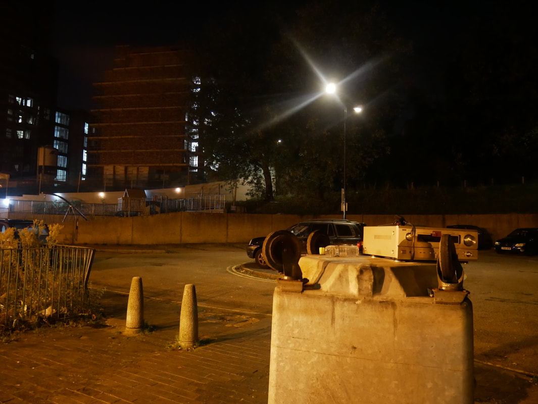
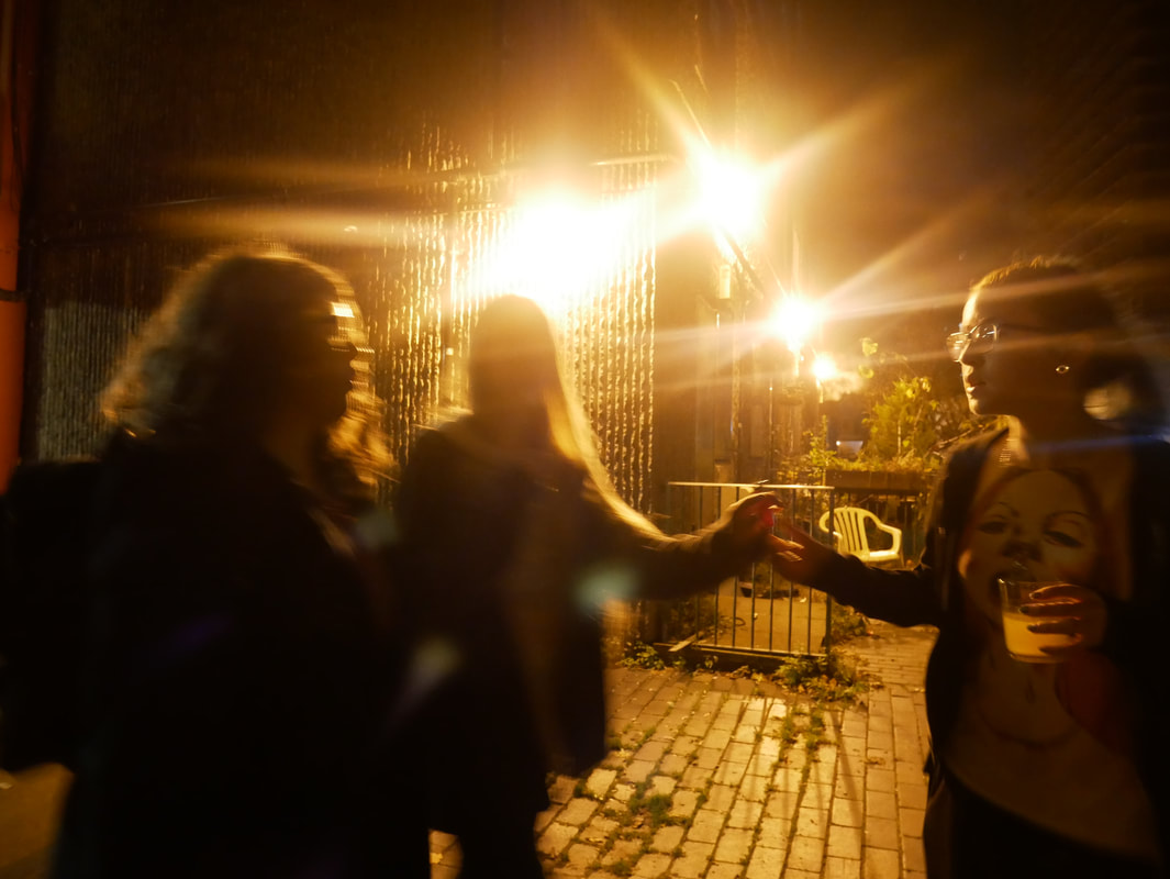
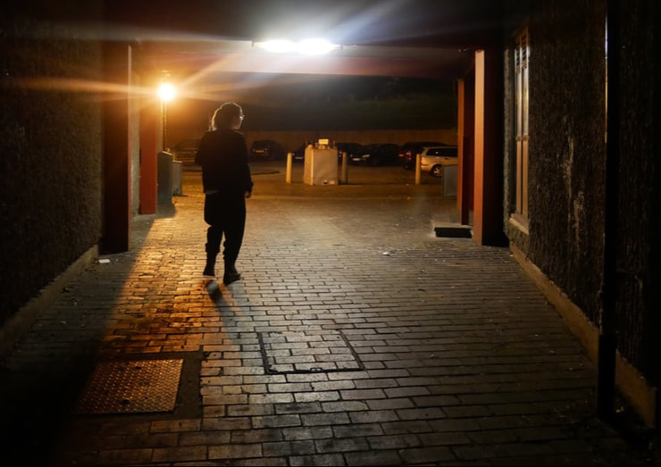
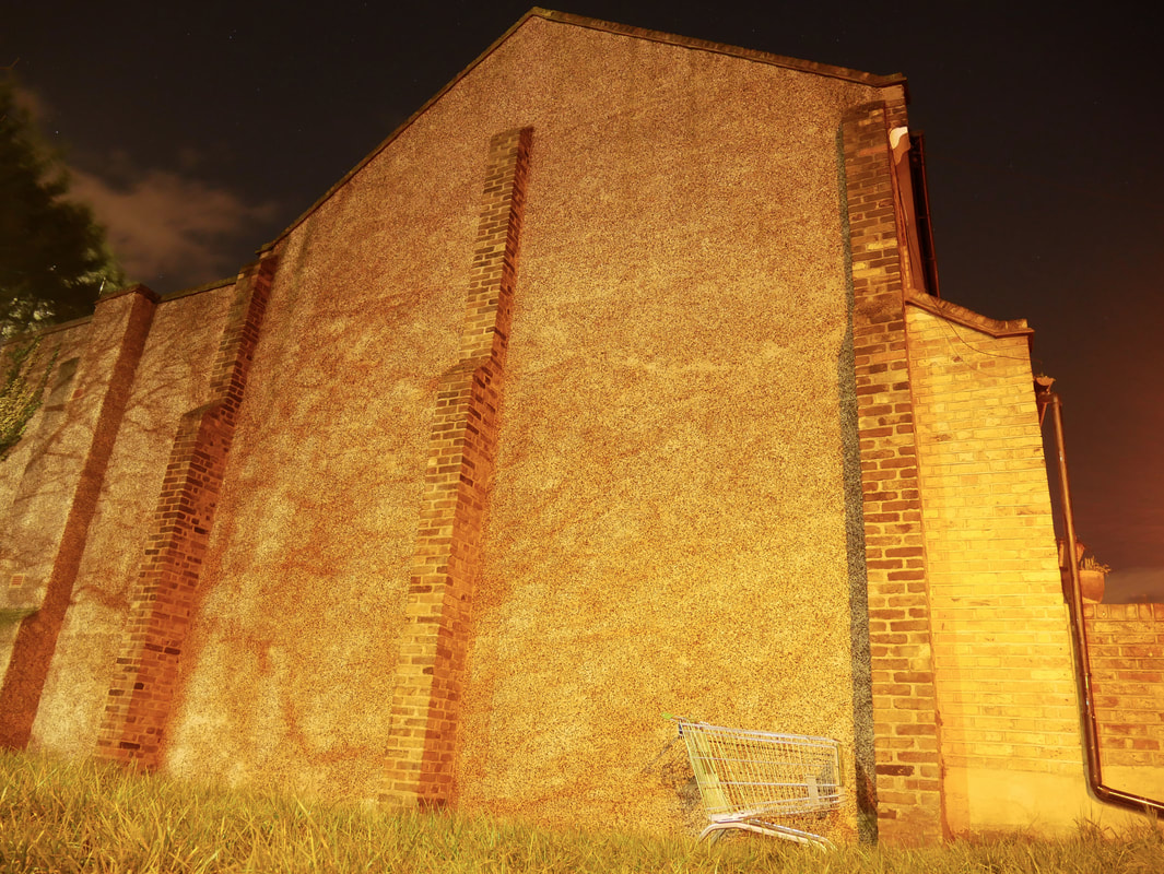
In this response I focused on capturing the way that artificial light (street lamps, headlights etc.) moves and works at night time in my images. I wanted to create a similar effect to the almost surreal yellow hue that you can find in many of her images. To create my response I travelled around an estate at a time of night where I knew that not many people would be around in the area because you don't typically see people in her images. I really enjoyed taking these images and I actually really like the way that the artificial light completely changes these images whole feel and gives it a sort of uniqueness from other images taken during the day. I like the way that the light reacts with the lens to create that nice flare that you can see in many of my images, and in Rut Blees work too. I also like the way that the light silhouettes certain shapes and objects in the fore ground giving for a more unusual looking composition as you might not be able to tell what it is that is in the foreground. Despite the fact that I really enjoy these images, I feel as if I did not quite capture the sulphuric yellow tones that really dominate her images in my photography. I also feel that the composition of these images could have been thought about slightly more to achieve the proper Rut Blees Luxemburg look.
writing about images
|
In this lesson we were given an image that none of us had ever seen before and asked to write about it in detail
|
|
second photo shoot
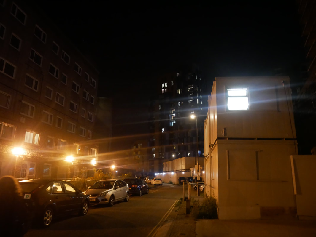
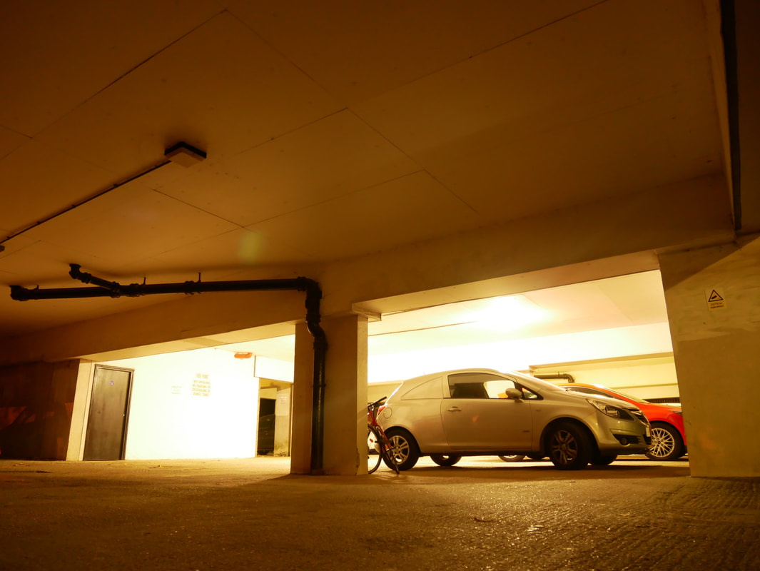
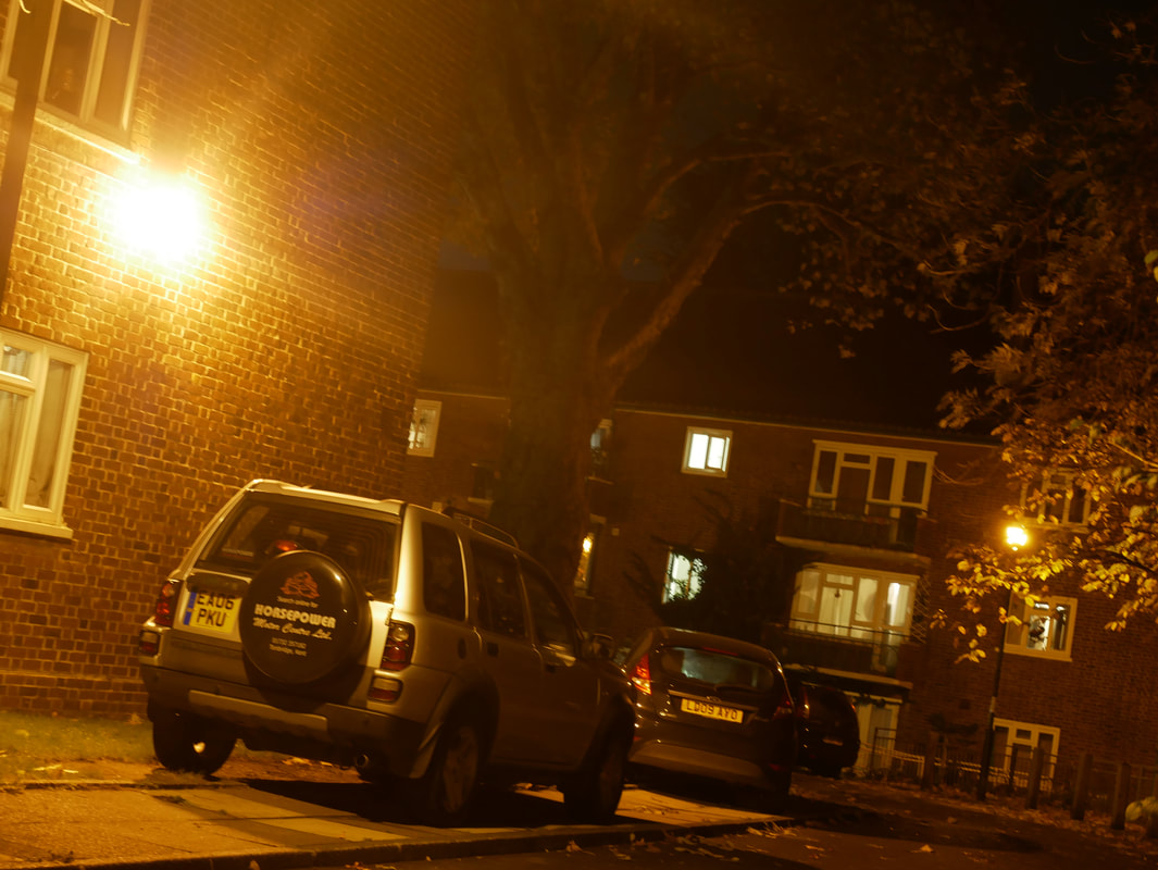
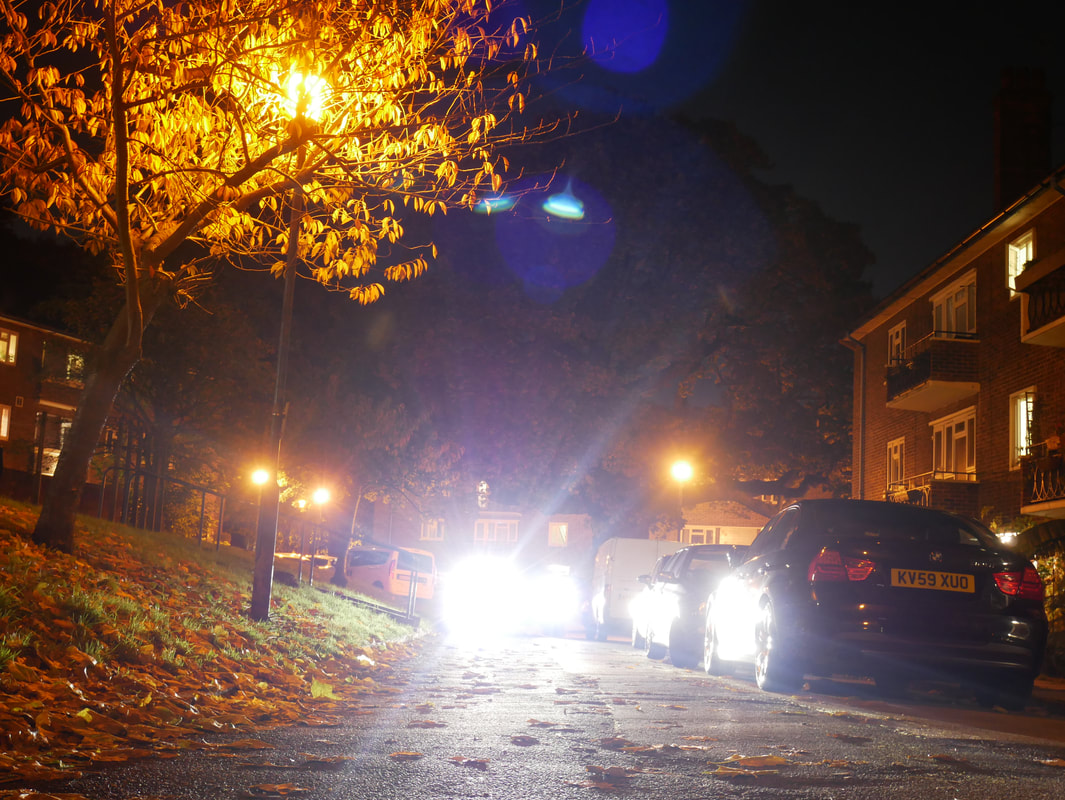
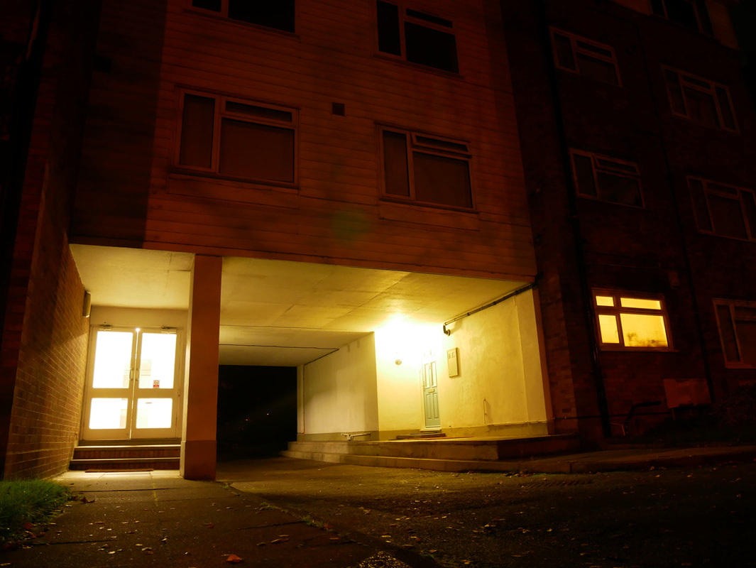
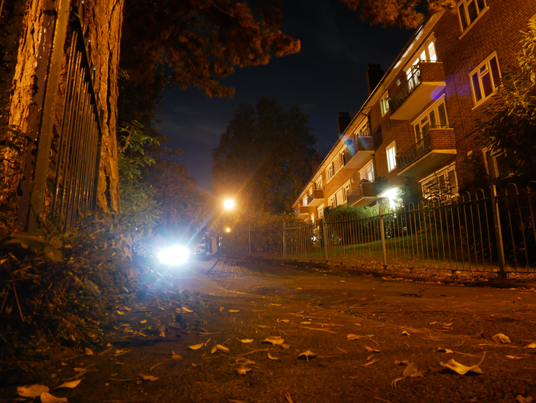
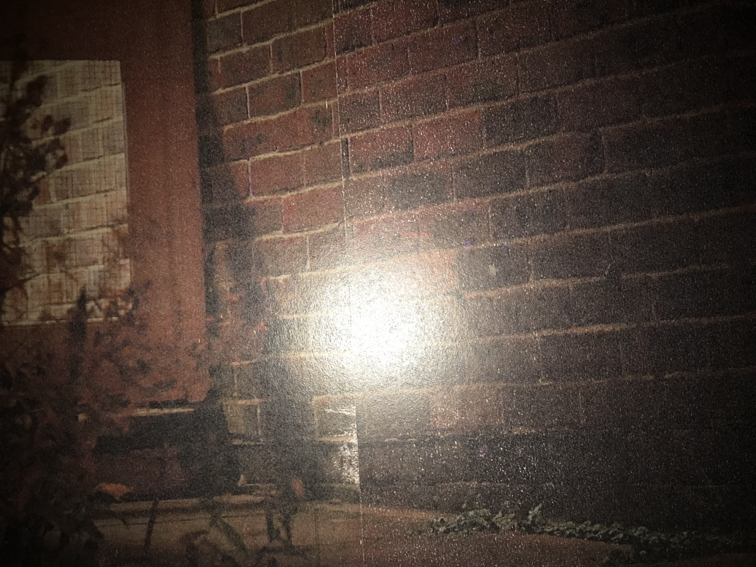
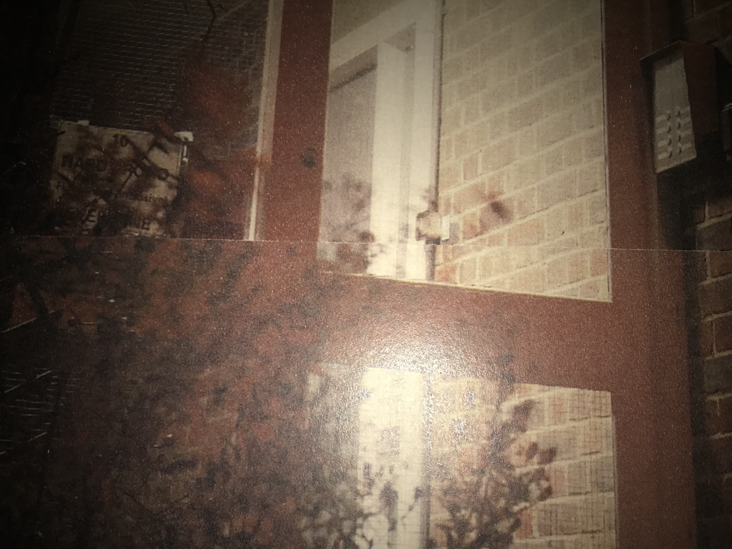
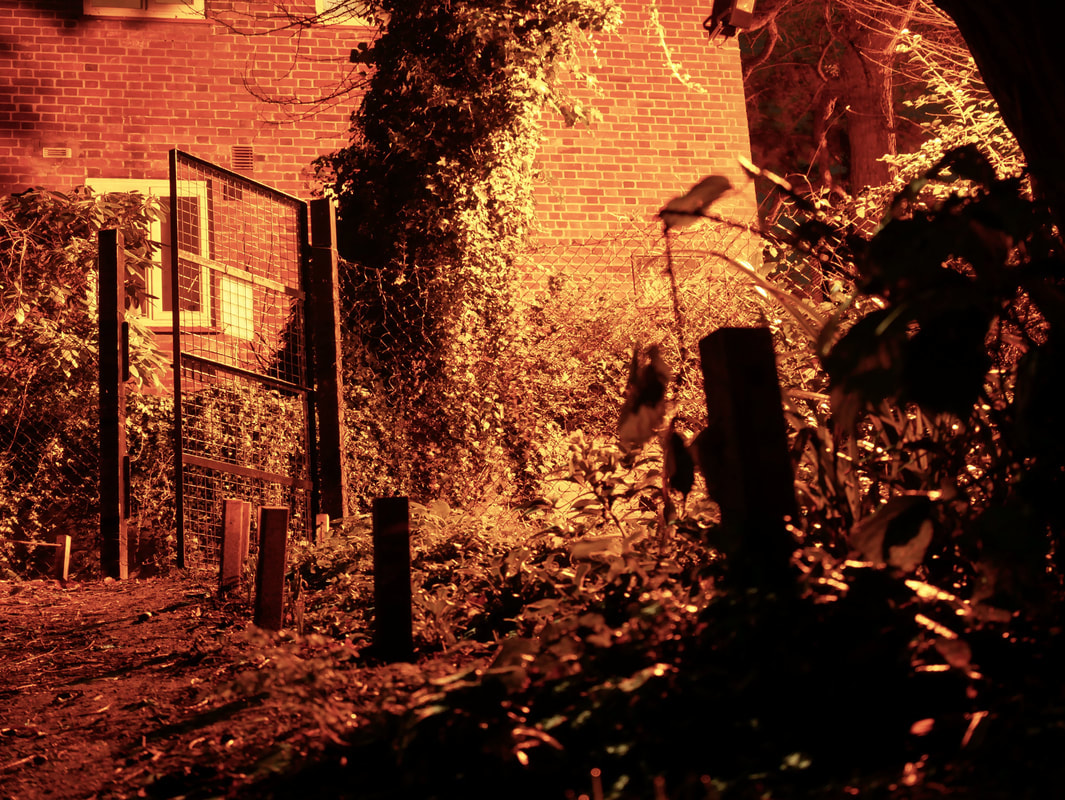
In this second attempt of creating photographs inspired by Rut Blees Luxemburg I had to change a couple of things as to make them different from the rest. On the first photoshoot I neglected to tamper with the aperture, and shutter speed settings on my camera as I thought that I could achieve the desired effect without them. However looking back on my images through a proper monitor instead of the display on my camera I realised that I could have made them slightly better.
Because of the low light and the fact that I was opening the shutter for long periods of time, I also brought along a small tripod to help keep the camera steady and get a more crisp image, this is partly why many of the images below are taken from such a low angle as my tripod isa bit small however I would prop it up on some things sometimes if I thought that the low angle wouldn't work as well. For most of these the aperture was was on the highest setting as to let in as least light as possible, however would I make the shutter speed to around 1-3 seconds depending on the amount of light available in the composition.
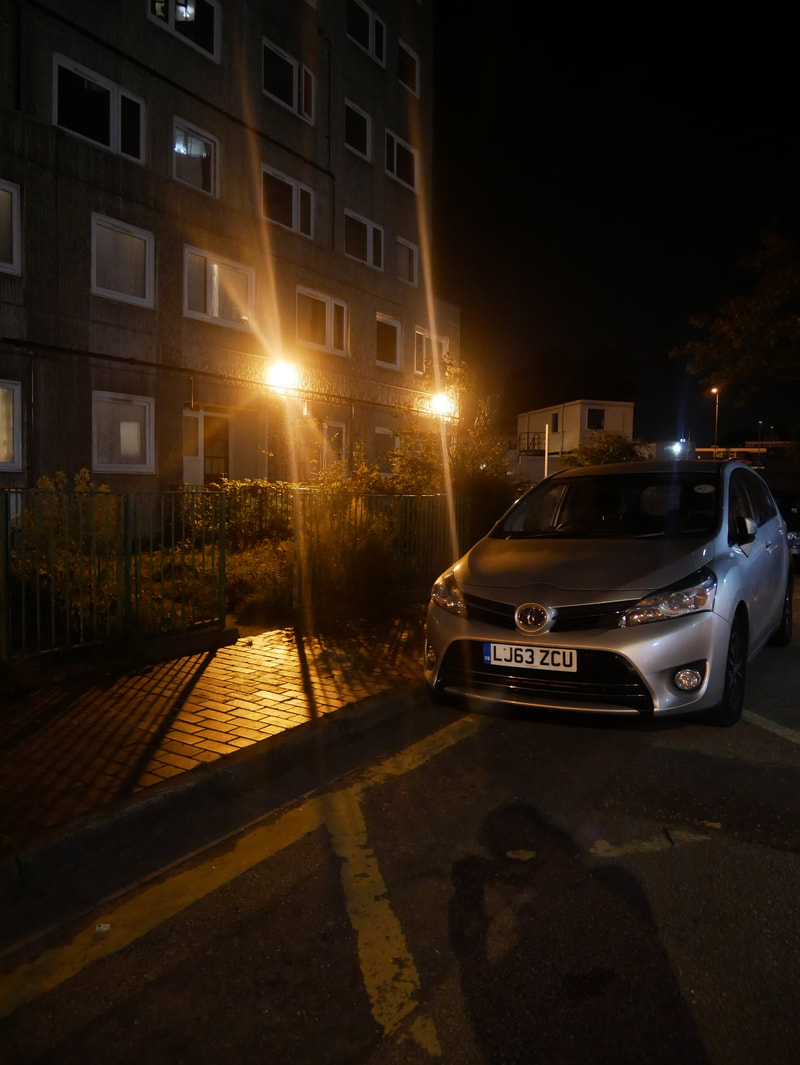
I much prefer this set of images to the first set that I went out to capture. This is because over all, these images are much more sharp in terms of quality than my first set where I was not using a tripod, I think it makes the image look a lot more professional, and easier to look at. I also really like the way that the light in the image falls inside the photo, and the way that the aperture and shutter speed settings allowed me to capture some really nice, high contrast images. I also feel as if I have achieved the sulphuric yellow and orange tones that I set out to recreate from Rut Blees Luxemburg's work.
Because of the low light and the fact that I was opening the shutter for long periods of time, I also brought along a small tripod to help keep the camera steady and get a more crisp image, this is partly why many of the images below are taken from such a low angle as my tripod isa bit small however I would prop it up on some things sometimes if I thought that the low angle wouldn't work as well. For most of these the aperture was was on the highest setting as to let in as least light as possible, however would I make the shutter speed to around 1-3 seconds depending on the amount of light available in the composition.
I much prefer this set of images to the first set that I went out to capture. This is because over all, these images are much more sharp in terms of quality than my first set where I was not using a tripod, I think it makes the image look a lot more professional, and easier to look at. I also really like the way that the light in the image falls inside the photo, and the way that the aperture and shutter speed settings allowed me to capture some really nice, high contrast images. I also feel as if I have achieved the sulphuric yellow and orange tones that I set out to recreate from Rut Blees Luxemburg's work.

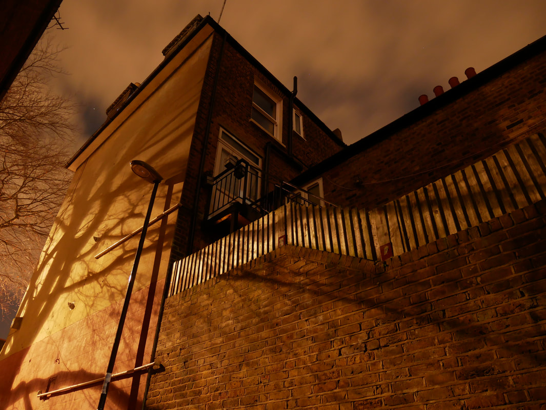
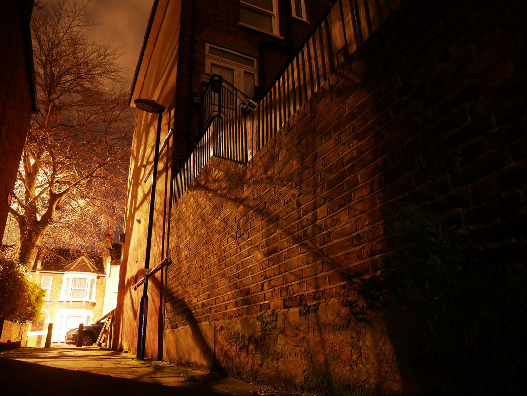
writing about my own images
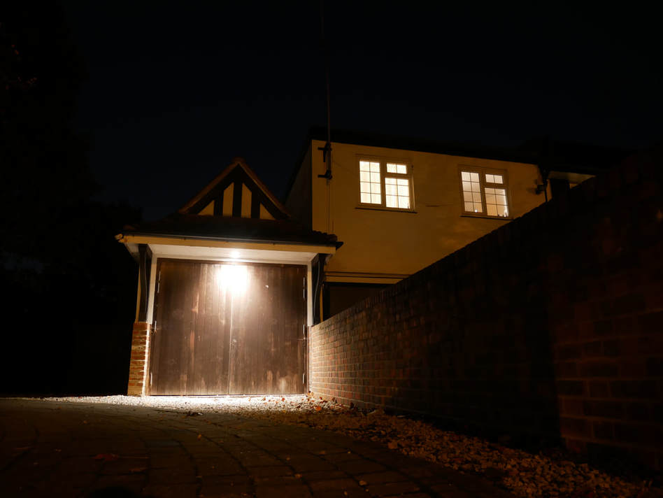
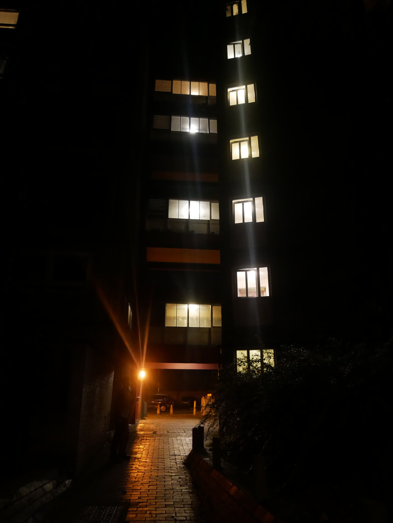
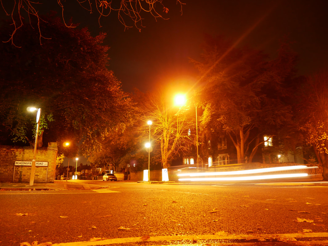
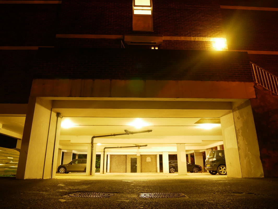
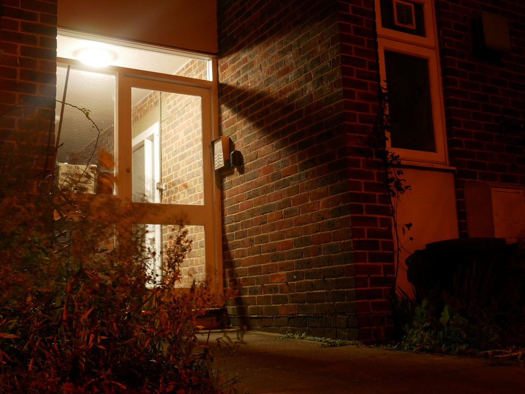
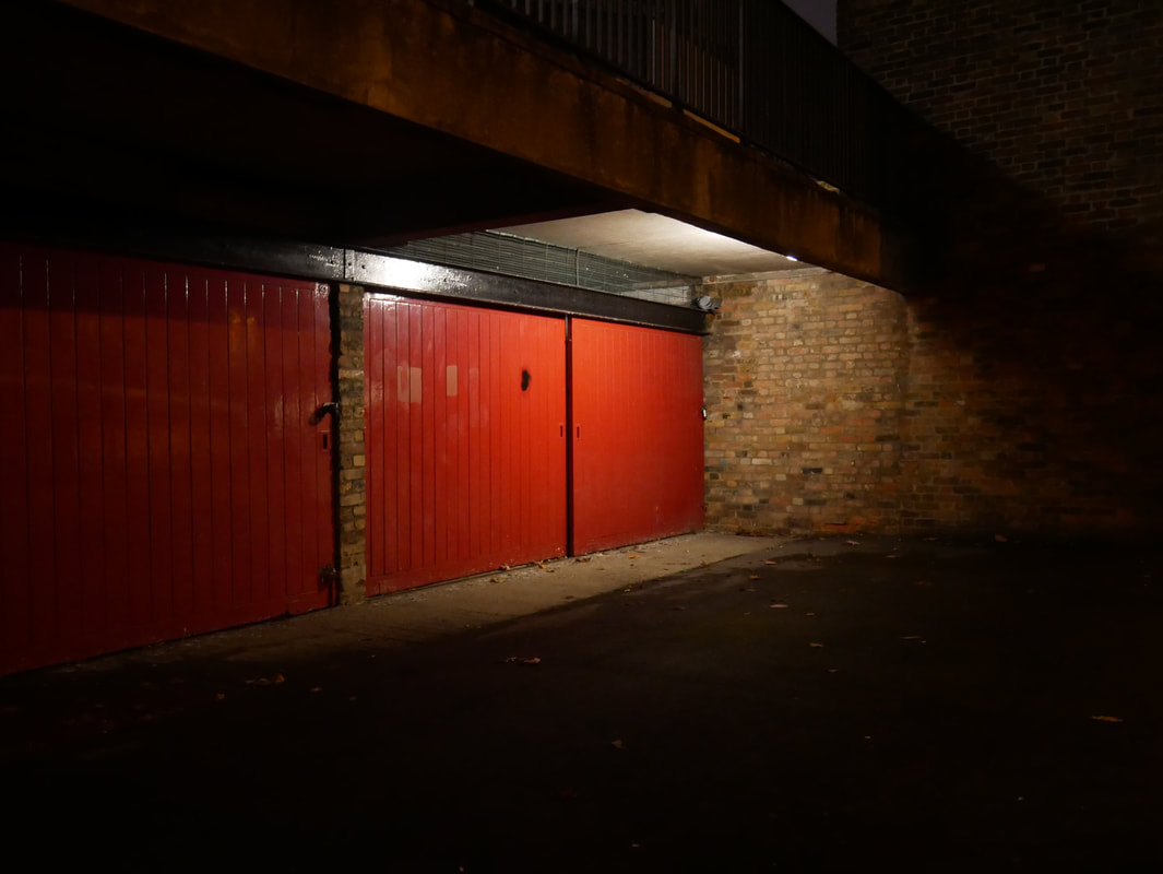
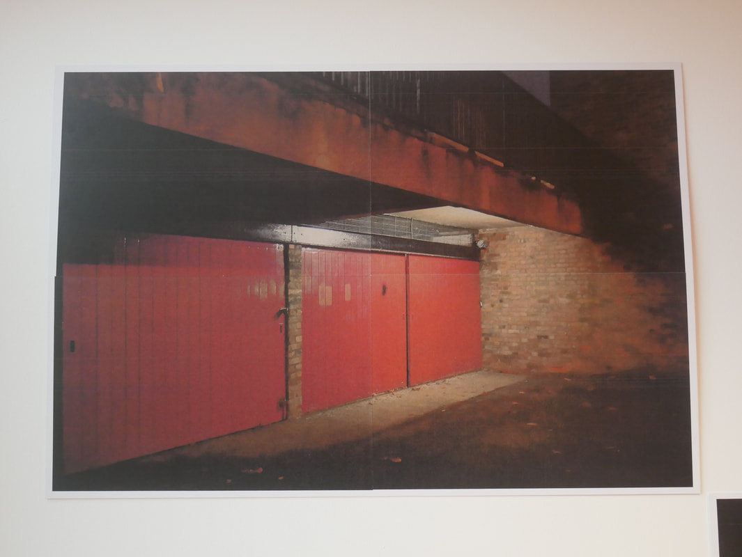
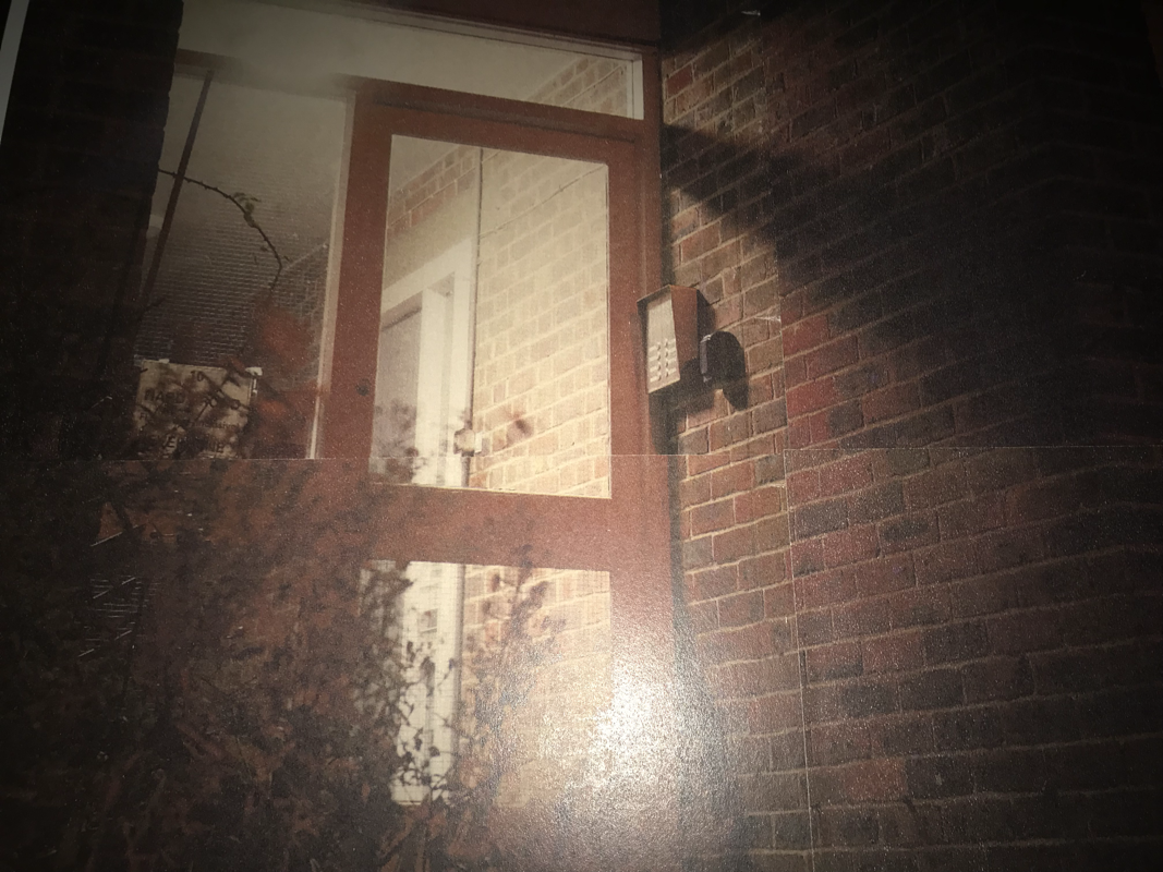
When taking this image I first considered the possible compositions by looking at the garage. I thought that by itself It would make a fairly strong image, however I noticed the two lightly light up windows on the house to its right, and noticed how the wall between the garage and the building with windows moves towards the camera at a slight but interesting angle making for some nice geometrical structural lines and I decided that I would want to try and incorporate these things so that it would be clear in the image that I am out on a street, in public. However standing up and considering the composition with my eyes I thought that the image lacked a certain interest, It seemed a bit too formal propping my tripod on a wall at eye level, and having everything sit neatly in the centre of the image. so I thought I might experiment with the angle of the image to just make it look that bit different. In the end I moved off too the left so that I would be looking at the subject from a slight angle, I also placed the small tripod on to the floor so that the camera is also looking up at the subject which I think also helps to translate a sort of vulnerability by having everything feel really big, and the viewer feel small. I think that all of this combined makes for a really nice composition for this image.
When framing this image I wanted to make sure that I included all of the important visual aspects in the image without having anything cut half way out of frame. but I also wanted to be close enough so that the subject does not feel too far away. To achieve this I just kept a close eye to my camera whilst slowly moving further away and paying careful attention, I also framed the image from a low angle to make the buildings and light seem almost intimidating.
I like the light and colour in this image a lot, I think that the light is one of the most important aspects as the entire image would have a completely different feel if it were taken in the day time. I wanted to make it so that the camera would only pick up the light coming from the lamp above the garage and the widows. To do this I had to change the settings on my camera because when taking the image the whole subject was actually decently lit up by street lights behind the camera, which is the low light that I did not want the camera to pick up. By doing this the image came out with a really nice contrast between the light and the dark, with the light being really light and the dark being really dark, which is perfect because I wanted the light, and the way that the light illuminates the buildings personalities to really stand out in the photo.
The colour in this image mainly consists of some slight yellow tones across the buildings, strong whites and very strong blacks that consume the negative space that frames the subject. I like these colours in the image because they are very recognisable and consistent with colours you usually see at night in urban locations.
There is a lot of space in this image, I think that it compliments the buildings and light that falls on them because it makes them really stand out against the negative space around them. I also think that it isolates the buildings as you cant see anything around them, which I like because isolation and vaunerablity of being out alone at night are some of the feelings that I was hoping to convey in this series of images.
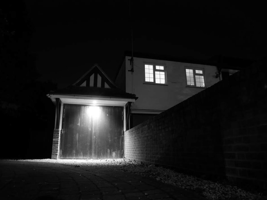
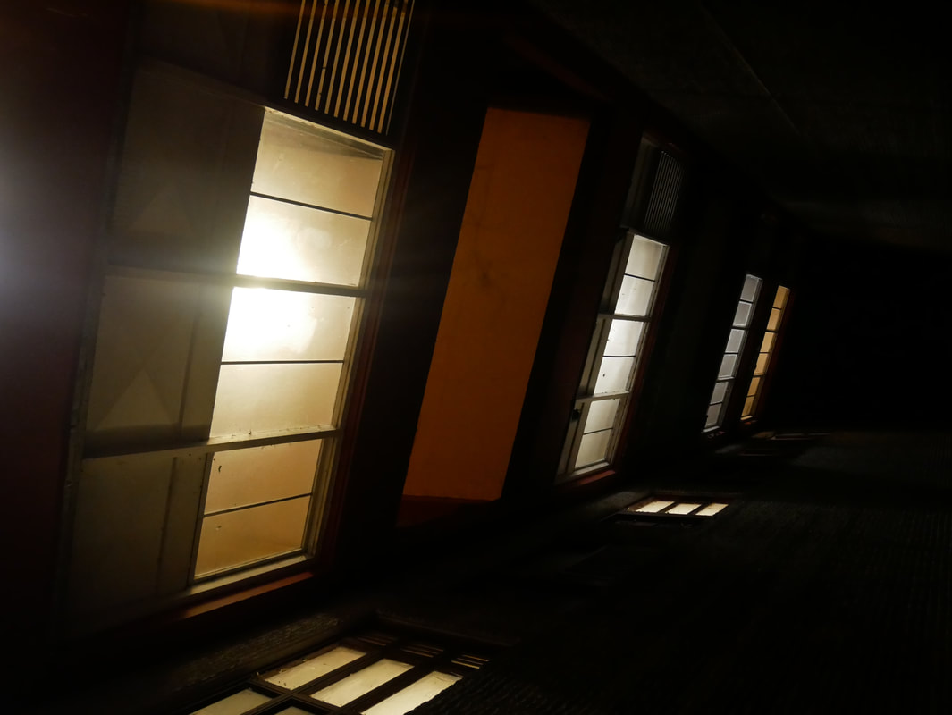
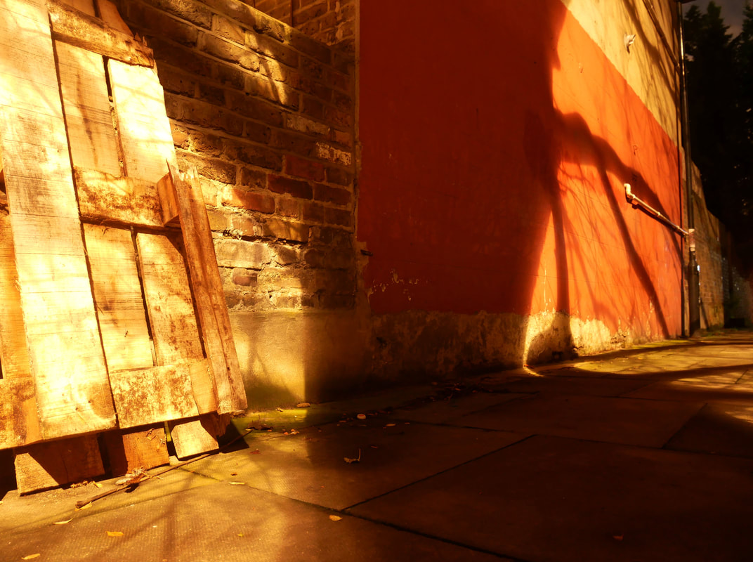
After creating my second Rut Blees Luxemburg inspired batch of images I started thinking about the high contrast in the images I had taken and how that might look if bought some of the images down to two tone in black and white. I wanted to do this first off because the image themselves I feel are so similar the Blees Luxemberg that I thought it would be nice too add something of my own to the images. I also think high contrast images in black and white look very nice anyway as it can sometimes make it easier to pick out details. I thought that the white light in the images would come out of the darkness and shine detail on certain places, like the wood grain on the door in the image below.
Im curious to experiment more with the black and white effect on my images, I will experiment with different times of night where there might be some slight sunlight to change the atmosphere of the whole batch of images, Probably early morning or when the sun is going down. I want to do this because I think it would be nice to capture the cold tired morning feeling.
MY third photoshoot
my first final piece
The number of images that I will be exhibiting will be three. The reason for this is that I don't want there to be too many images for the viewer to get distracted by, I want the exhibit to be to the point and snappy. Another reason for this is that I want the rule off odds to draw my viewers attention in to the images and keep their eyes searching across my images because the number three subconsciously appeals more to people.
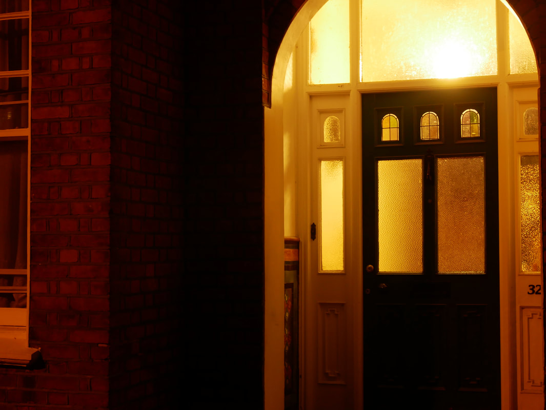
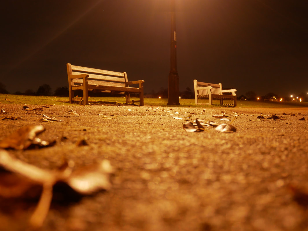
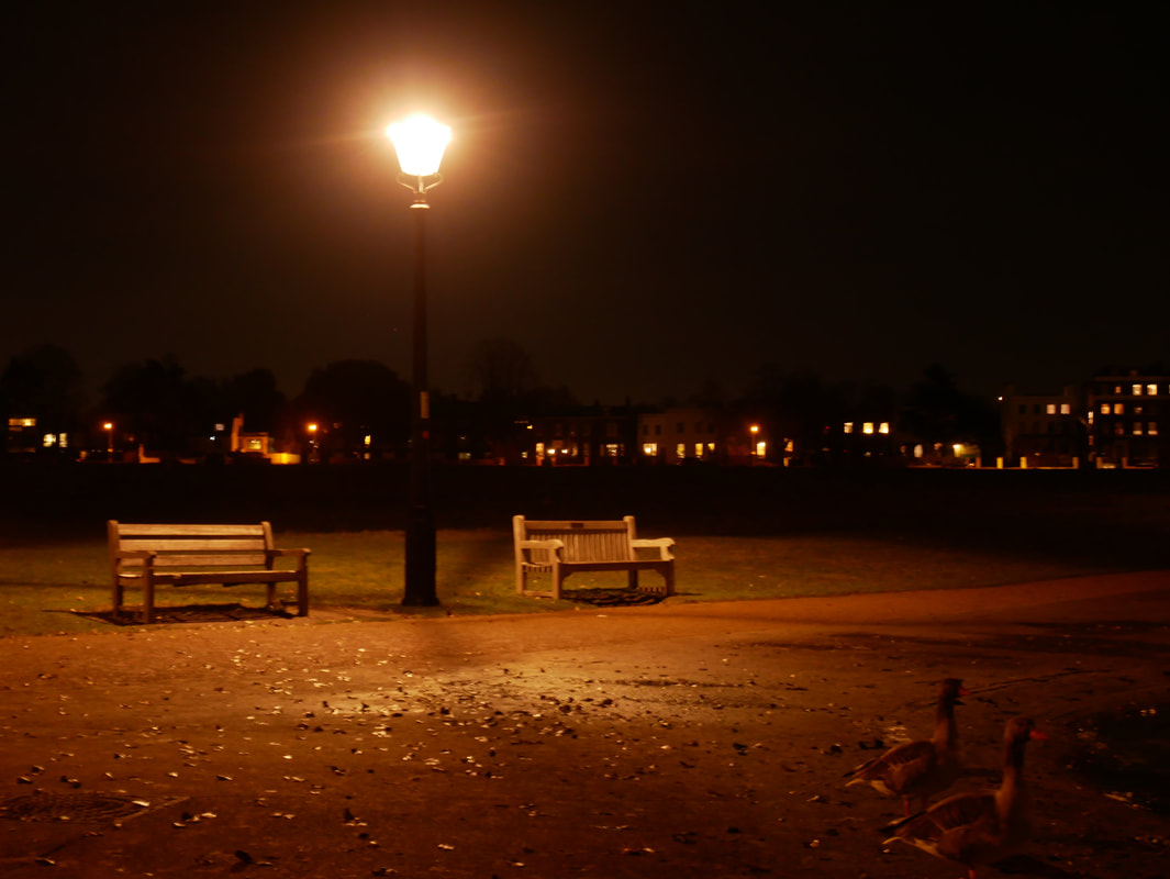
The three images that I will be choosing for the the exhibit are the one of the red garage door, the two benches either side of the lamp post and the glass doorway with the light on the inside, these are below. The reason that I chose these images is not because they are necessarily each my individual favourites, (although they are from a list of images I prefer from the rest). I actually chose these images because of their ability to work well in a short series together, as they each compliment the others in my opinion. The images don't include too much red throughout each other, not too much negative space, not too much repetition in general throughout the images other than the general subject matter relations, and the light colour hue which can be quite similar throughout however I think this is important to keep the images connected.
The three images that I will be choosing for the the exhibit are the one of the red garage door, the two benches either side of the lamp post and the glass doorway with the light on the inside, these are below. The reason that I chose these images is not because they are necessarily each my individual favourites, (although they are from a list of images I prefer from the rest). I actually chose these images because of their ability to work well in a short series together, as they each compliment the others in my opinion. The images don't include too much red throughout each other, not too much negative space, not too much repetition in general throughout the images other than the general subject matter relations, and the light colour hue which can be quite similar throughout however I think this is important to keep the images connected.
first final piece
photoshoot
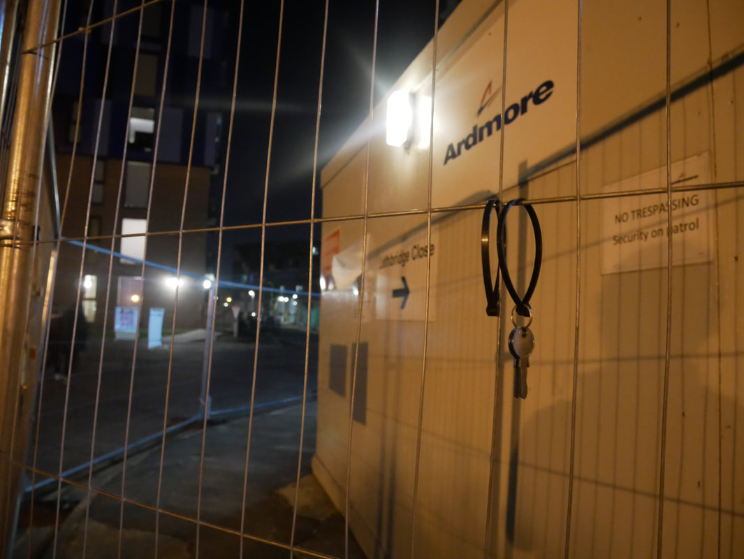
After this I then decided that these photoshoots would be enough for my first final piece, and so I got started on thinking about which images from the selection I thought were my best, and which ones would work well in a sequence. I would also have to start thinking about how I would want to present and exhibit my works, where is there good light, how big do want to print the image and what will I mount the image on to, etc.I also want to try and print on a paper which has a surface with less of a glossy, and shiny surface so that the final print will reflect a lot less light and become more of a matte finish. To achieve this I will be experimenting with printing out on to sugar paperWith the printers available to me, in order for my images to be displayed in A1 I will have to use a special technique because our printers do not print in A1. To do this I began with my images in photoshop, where I had to evenly divide the image in to four exactly even quarters using the guideline tool. Each one of these four quarters I will then have to photocopy, and individually be printed out on the four separate A3 pieces of the sugar paper.Once I have completed printing the images out I will be using a trimmer to cut away the small sugar paper border that will be left around the A3 piece as accurately as possible so that I avoid cutting away much if any of the actual image so that they all fit together, and the images match up seamlessly when put together in its final A1 state.Once each of the four quarters borders have been removed I can begin mounting them on to a piece of A1 mounting board, using spray mount and making sure that when placing the images next to each other they both line up with each other, and that I am not leaving any creases, or glueing in wonky. Once each of the four quarters are glued down next to each other to create one big A1 image, I then used a box cutter and a meter long ruler to trim around the edges of the final piece removing strips of mounting board so that the white border around the image is just a little bit smaller and more uniform.After thinking about my previous presentations of work I noticed that I very often display my works on a black background to compliment the dark within my images, because of this I decided to instead use white, just to experiment as I have rarely done this in the past and this is not my last final piece. I also decided that I wanted my images to. be displayed similar to photographer Rut Blees Luxemburg, and have them displayed quite large make them a lot more dramatic and impactful to the viewer, which is why I chose A1 (a realistic large size for the available printers). After considering where I might want to exhibit my work I chose to use an area of corridor that is not to crowded, and sits nicely next to some quite large windows which means that the exhibit will be nicely lit up with natural light, however I am considering for my next final piece what it might look like in a dark room with artificial yellow light lighting up only then images in the room, replicating the conditions in my room.
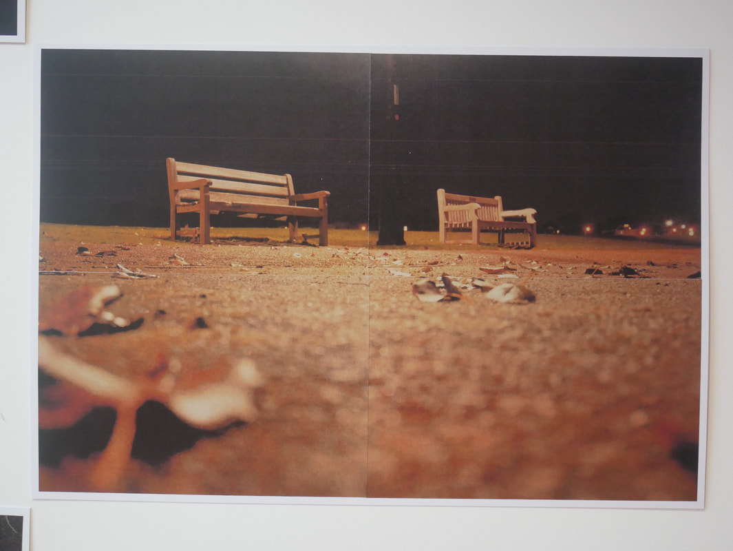
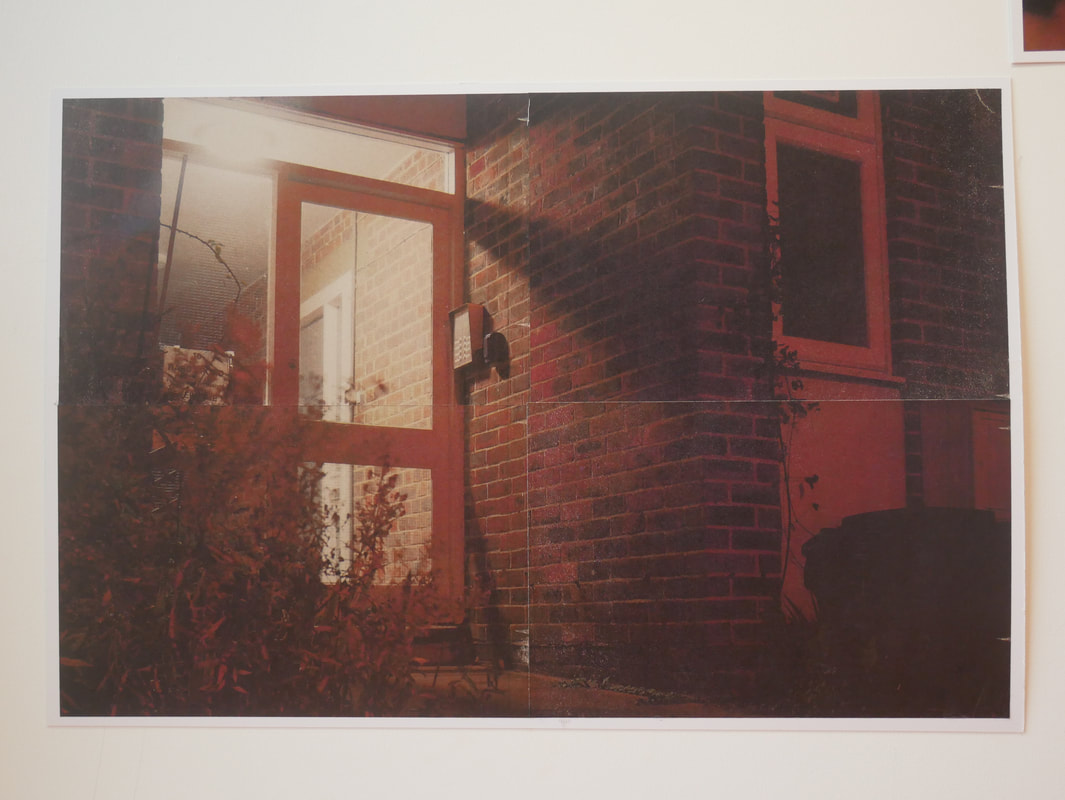
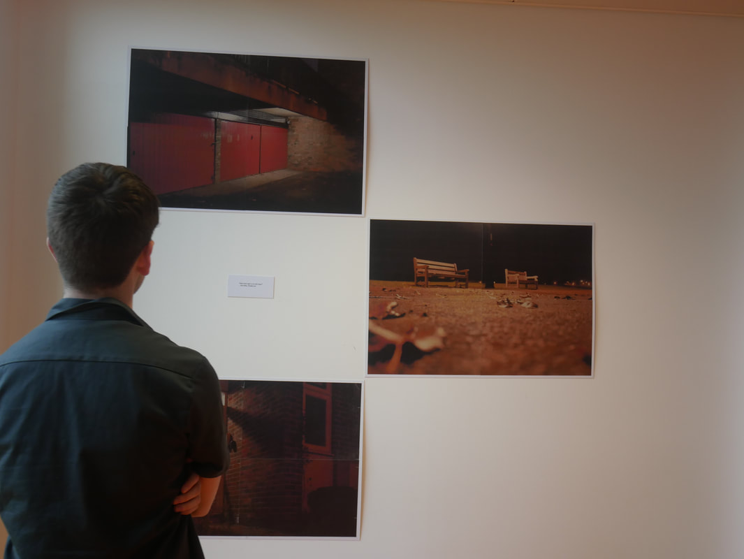
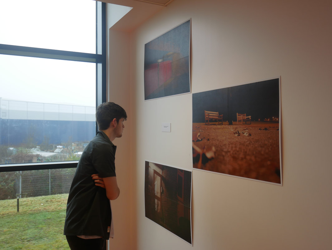
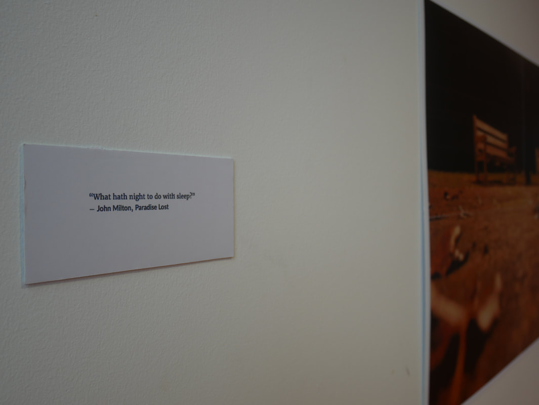
I think that this first final piece and presentation went really well. I really enjoyed the layout that I chose for the the three images to be presented in, I` thought it really complimented the images and made the images as a series really easy to look at and take in, I thought that it also wasn't too formal of a presentation as it would have been if they were all in a neat row. I like this because I feel like avoiding such compositions increases a feel of creativity, and accomplishing something new, making the exhibition seem more fresh and interesting. I did also add a quote from ()()()()())()()()() -"what hath the night to do with sleep?". I added this because my images are taken at the dead of night, when no one is up wondering the streets, however I feel like the way in which I take my images, and the way in which the images in the exhibit are photographed makes the viewer feel very awake, and almost alert because of the overpower full bright street lights and sense of space, which is a popular state of mind that can be important to have out late at night if you might need to protect yourself.
anna lucas
For my second final piece I wanted to try something a little different to anything id done in the past. I wanted to exhibit my images in a way that resembles and connotes a similar message and feel to what I am trying to convey in my images. I wanted to abstract my work through the way that I choose to exhibit them rather than when I am in the process of taking the image, or in any post production programme like photoshop. I also wanted to have this abstraction include the main feature that is always present in the series, which is light, in the darkness. After looking for artists that might give me inspiration I came across two that could be of help...
Anna Lucas is a filmmaker, artist who is concerned with observing and documenting social networks and individuals in correlation with their geographic location. Her practise and the way that she documents it is very involved in experimenting with what happens when you observe something through a view finder.
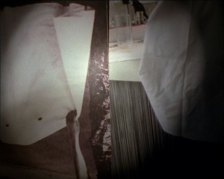
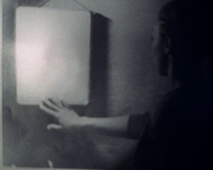
I will be taking inspiration from her series "Things that had stories rubbed out". In this series Lucas experiments with documenting found imagery using video. However it is the way in which she documents them in the video that I am concerned with. Lucas displays her images inside a very dark shed, and then uses a flashlight to scan over the images whilst using the recording camera to follow the light over and throughout the shed. She is using the flashlight within the darkness to create a viewfinder in which we as a viewer can look through and it does indeed add an entire new feel to her work.
I feel like this technique that she has developed where she scans her images in the dark with a flashlight might make for a really nice final piece as a video, since I have not yet used this media to create a work.
my second final piece
anna lucas inspired experimental video
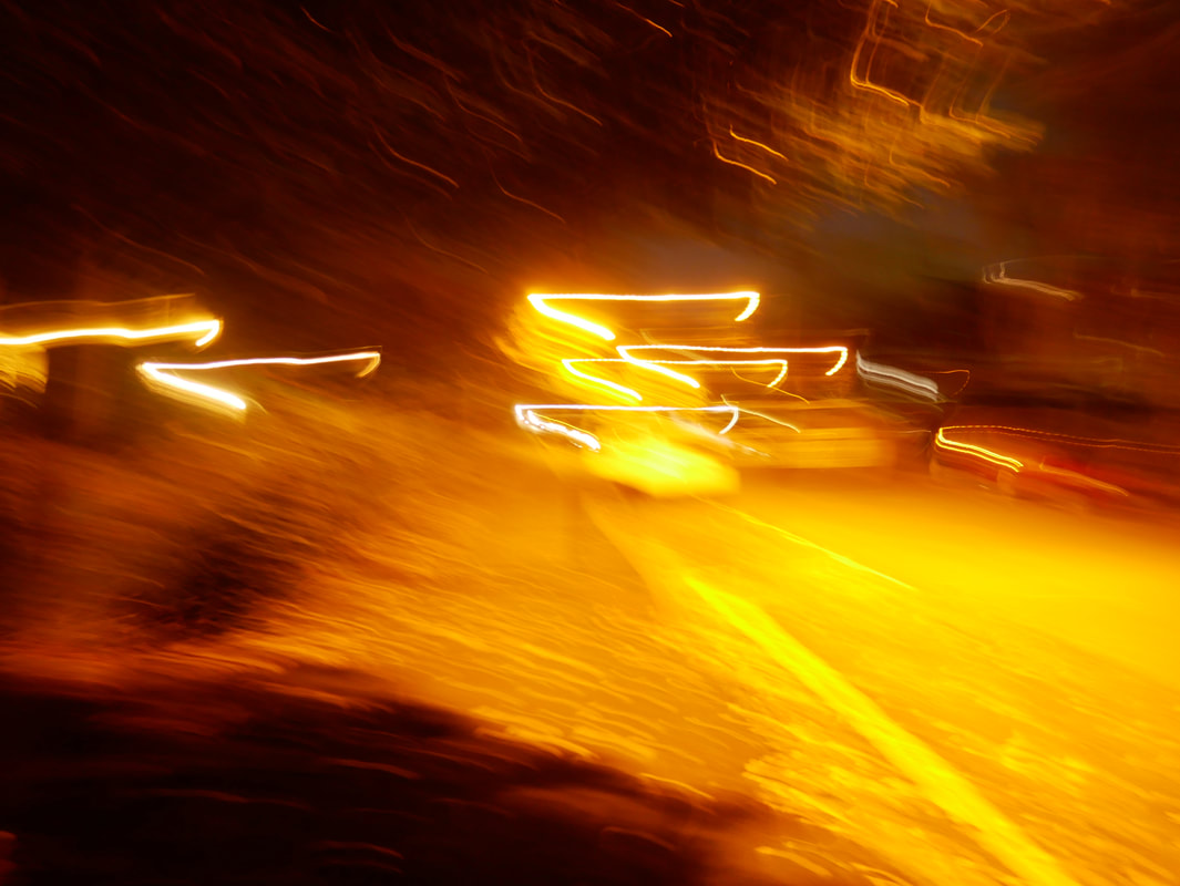
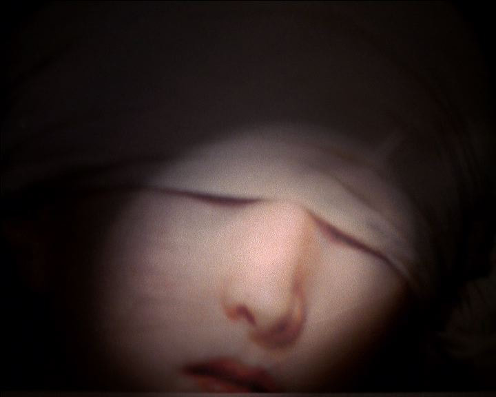
This is an experimental video of a photo from one of my previous final pieces inspired by the filmaker Anna Lucas where I am looking in to using a flash in the dark to document and exhibit the photography. I am pleased with the outcome of this short video because I like the way that you have to piece together the photograph with only being shown little bits, and hints to what the entire image is actually of. I also really like how the reflection of the flash
These are some experimental photos that I took of the image with the flashlight whilst I was in there filming. I like these because of the over exposed areas in the image where you can see the flash from my phone reflected in to the lens which makes it easy to recognise the fact that the image of the image was taking in the dark with only the phones flash to light up the image which is important because the way these images are photographed is supposed to be slightly eerie and strange. I like some of the closeup stills also, this is because I feel like they give off a very similar feel to the close up video that I recorded which is good because that is what I was going for.
|
|
my third final piece

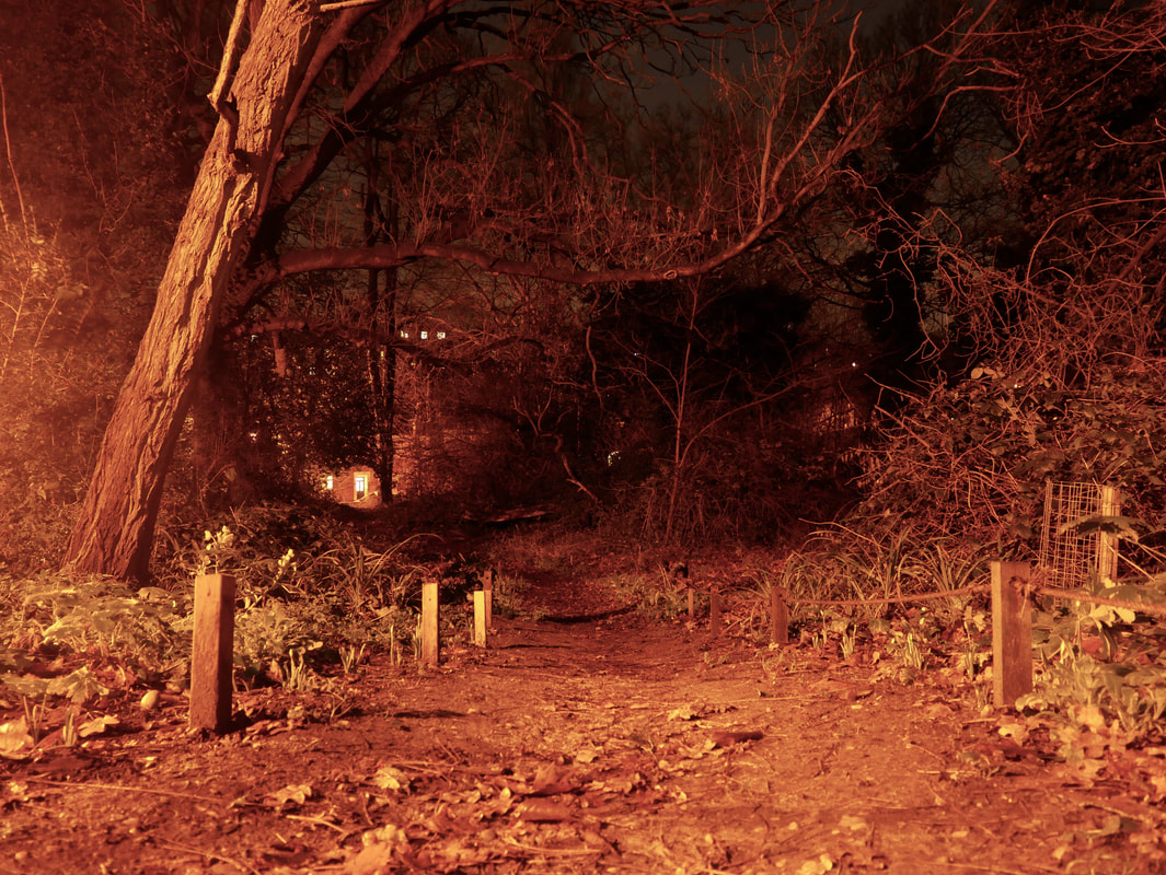

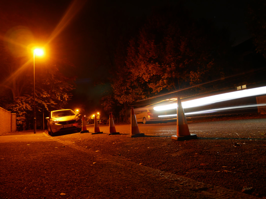
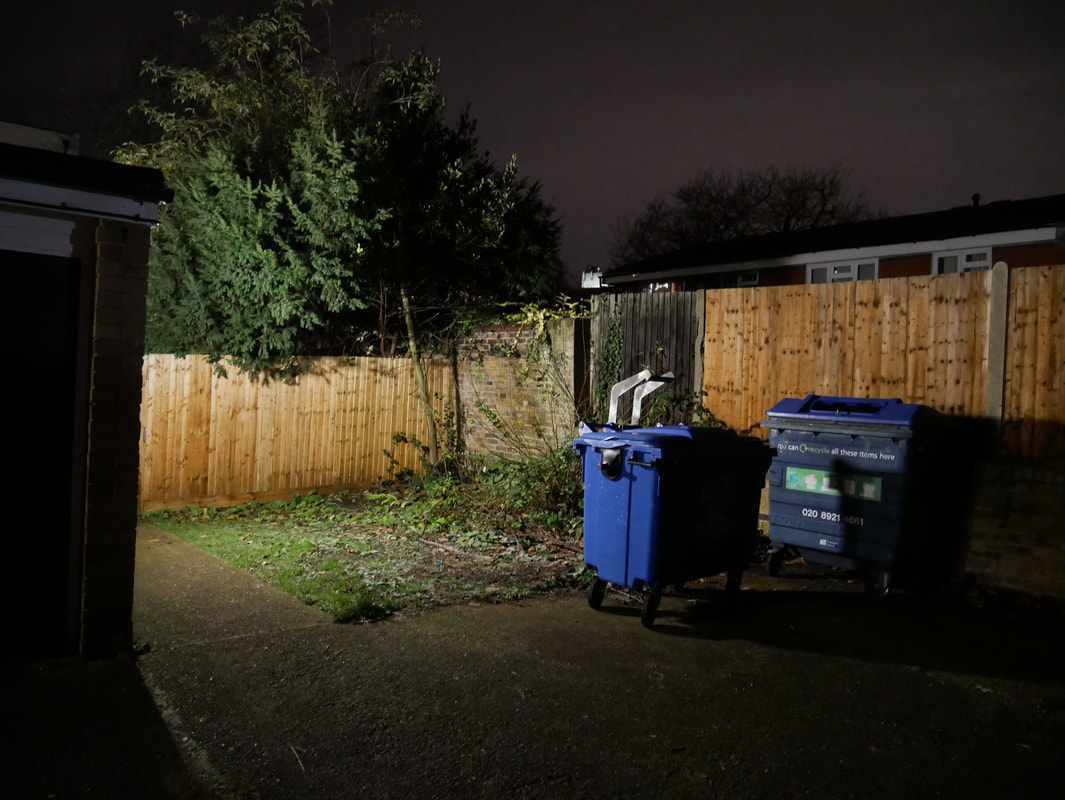
This has probably been one of my most successful photoshoots since starting to work with my night time compositions and experimenting with the way light works and looks when there is not a lot of it. The things that I chose to do differently in this shoot was to really keep my eyes up, looking all around for different, more unique compositions. I also could not think off the top of my head of any areas where I might have good luck finding compositions to photograph, so I ended up going fora walk, moving through areas that I have not really been or explored before. With this I did actually find success, I found that when exploring these areas, my eyes were more observant of my surroundings as I was seeing everything for the first time, as opposed to knowing what might be around a corner and so not really paying attention. This meant that I was noticing a lot more photographic opportunities and was more eager to document what I was looking at.
With my compositions I was trying to be a little more brave and experimental, really trying to think outside of the box with the angles I would choose. I also decided that I would not photography any doorways as they are usually lit up and prove to be an extremely easy option to photograph and dont really require any hard thought or consideration, I have also already taken too many images of doorways and suchlike.
With my compositions I was trying to be a little more brave and experimental, really trying to think outside of the box with the angles I would choose. I also decided that I would not photography any doorways as they are usually lit up and prove to be an extremely easy option to photograph and dont really require any hard thought or consideration, I have also already taken too many images of doorways and suchlike.


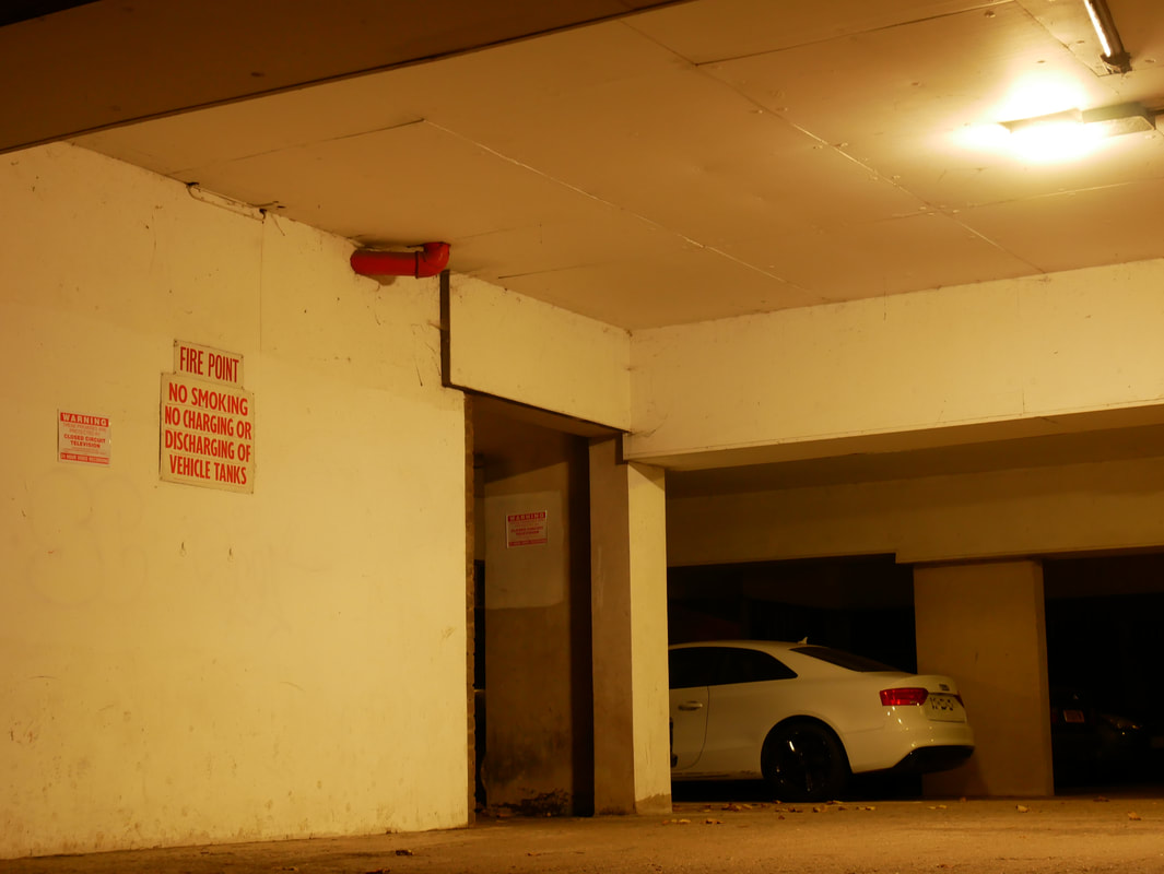
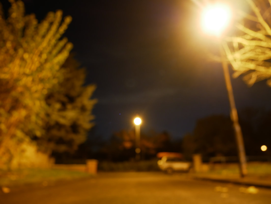
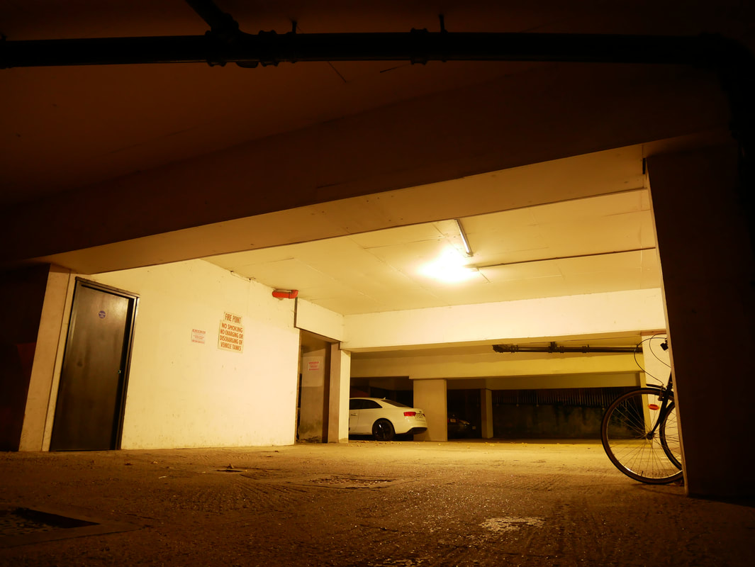
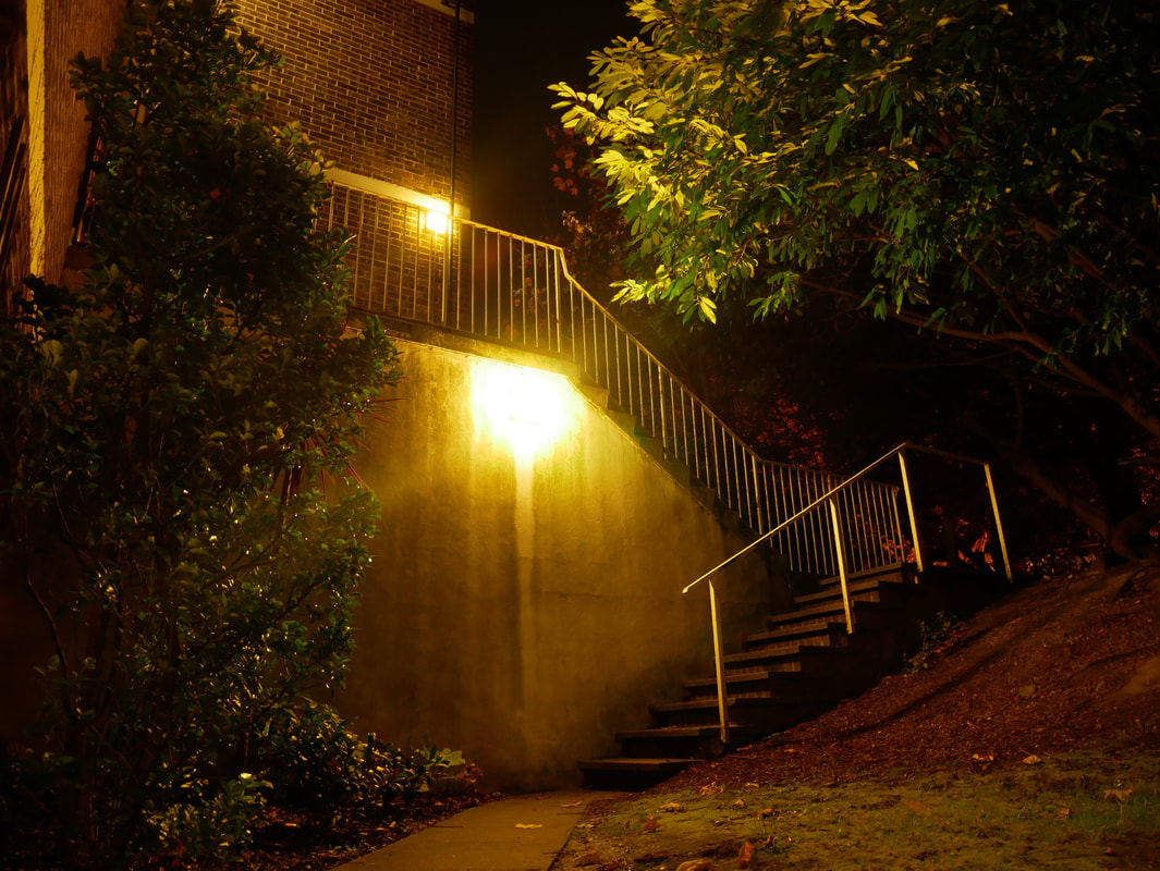
These four images are the ones that I thought worked best out of my photoshoot. This is because I feel like the message of feeling alone and vulnerable at night are translated most within these. I also feel like the various experimental compositions within the different photos when I was playing around with angles, shadows and depth really worked out well, and are noticeably different to my other photoshoots. in my opinion, I think that they also really compliment the message that I was trying to connote.
My plan would be to professionally print out some of my favourite images from my last photoshoot at a similar size to my last final piece (around A1 size) and display them around a dark room, where I could use a flashlight to investigate my night time compositions through shining a flash or other external light source on to parts of the image and slowly move around my works. With this experimentation I am looking for an extended feel of isolation and vulnerability because of the dark, quiet room in the video, and the viewfinder that is created by the light and framed by the darkness. Moving the camera around my images is also a connotation of a journey, a journey that mostly everyone has experienced when walking through the streets on your own at night.
For my final piece I sent off four of my favourite night time images to have printed out in A0. I wanted my prints A0 because I wanted to be able to come up close to the print and really be able to investigate all of the little details within the image. I also feel that the images become a lot more powerful when seen on a larger scale because they make you feel more as opposed to smaller prints of images which make you think more. I got the A0 prints done in a full bleed so that there is no white border around the image because my plan is to set these images up in a big open space where I can turn off the lights and illuminate the images with my own artificial light source to further explore the idea of artificial light, and I don't want the border of where the image meets the wall to be too obvious. I want to use yellow lights that are similar in colour too the street lamps in my images, so something like a naked bulb, or bedside lamp, as long as the light isn't too blue, or too bright, and it will shine from underneath the images. I want the instillation to be a similar environment to when your out on the streets late at night, when its dark and you only have the lights from cars, lamps and windows to see things.
