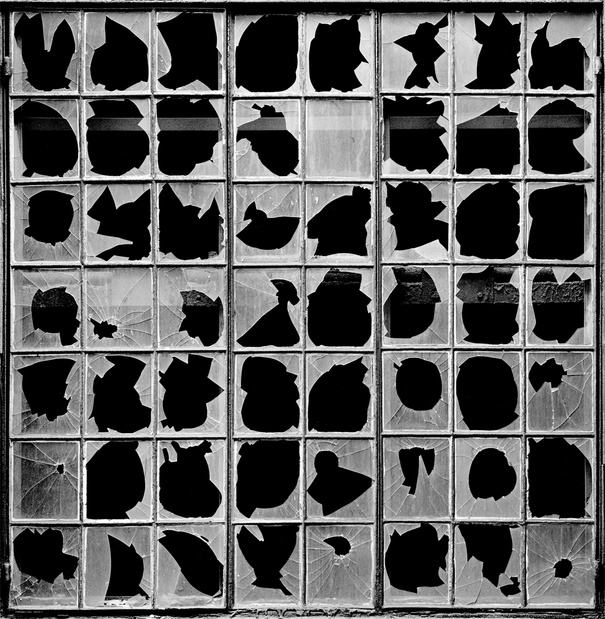
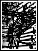
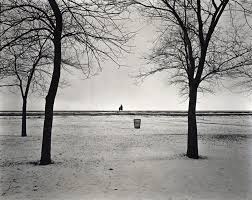
Keld Helmer Petersen
Keld Helmer Petersen was a Danish photographer who worked in black and white, trying to capture interesting lines, shapes and geometric patters with his camera, and getting rid of most of the mid-tones, some times completely removing them. This would leave his photos with extremely high contrast between his blacks and whites creating (in my opinion) very interesting and visually pleasing photography.
Peterson's photos for me are almost comforting too look at, his photos being so simple and cleaver there is nothing in the images that would confuse, or make someone feel uncomfortable other than maybe the unknown location and what an object in a photo might be, however to me none of these matter as the point of his photography is not about objects or locations but surfaces, patterns and textures etc.
Peterson's work was greatly inspired by Albert Renger-Patzsch and the Neue Sachlichkeit (New Objectivity), hence similarities in their work, focusing in on textures and surfaces, although obviously Peterson's work does differ from Patzsch's as Patzsch liked too keep more mid tones, however personally i really like both of their works.
If I had ever met Patzsch, some of the questions that I would have asked might have been how he knew if a photograph he was taking would look nice post editing before he even took it, how to know what kinds of things and places might be nice to photograph, and what about his style of photography really made him passionate about it?
I also think that Petersen is trying to communicate in his work something extremely similar to what artist interested in the Neue Sachlichkeit like Edward Weston and Jamoir Funke, which would make sense due to his inspiration from Albert Renger Patzsch.
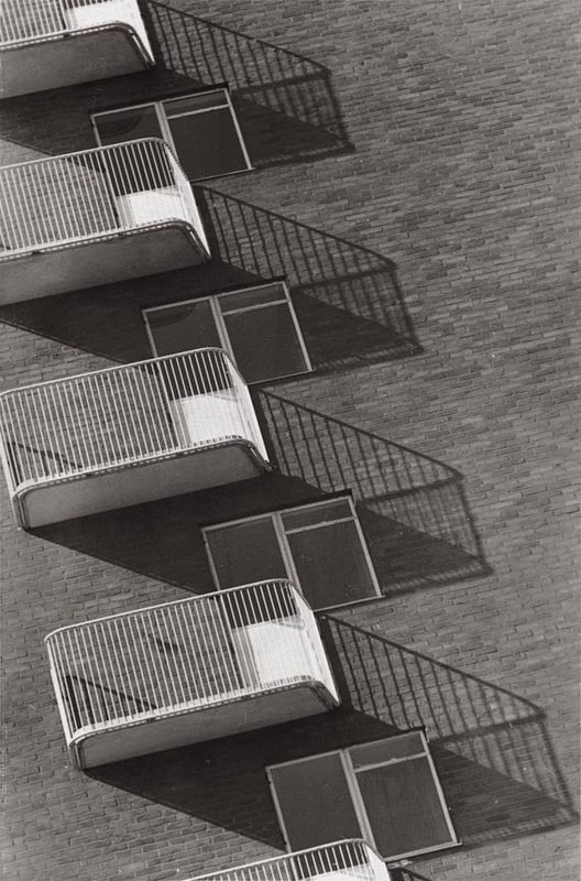
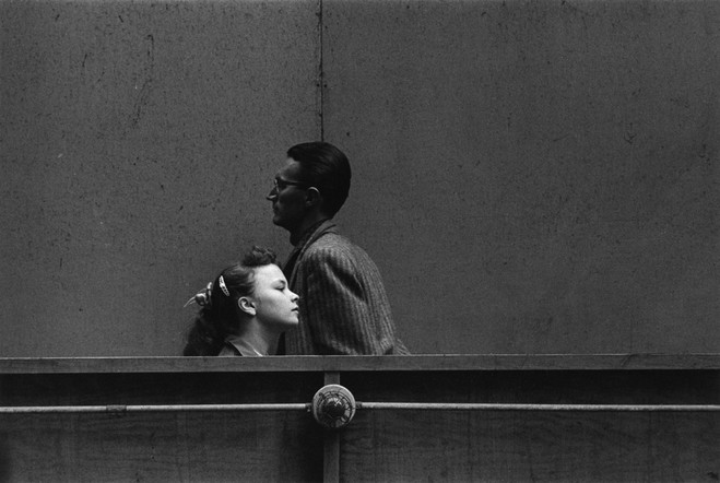
Harry Callahan
Harry Callahan is an American photographer who's routine was to wake up every morning, go for a walk with his camera taking many photos of everything he saw and then spend the rest of his evening developing his best negatives using multiple exposures. Despite all his active photofraphy he only produced less than half a dozen final photographs a year.
He photographed his family (wife, daughter), buildings and streets from all round the city where he lived concentrating on on a strong sense of line and form and contrast between light and dark. He would sometimes even use his wife and daughter in photographs of large vast landscapes where they would look small in comparison to show contrast here too.
Callahans photography greatly refelected his own life, he would encourage his students to turn the camera on their lives too much like he did leading as an example.
my response
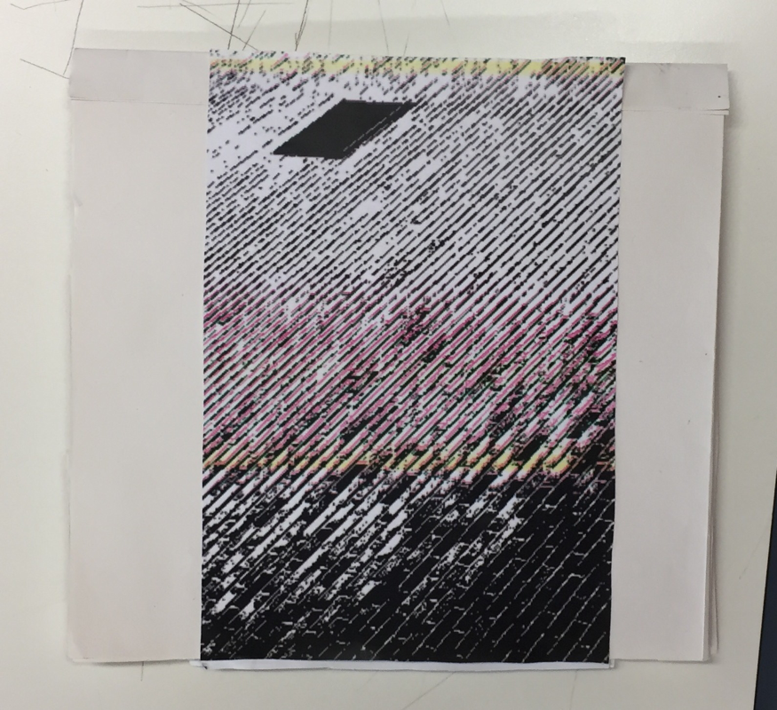
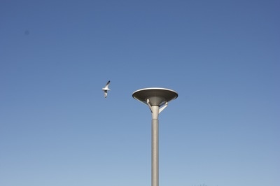
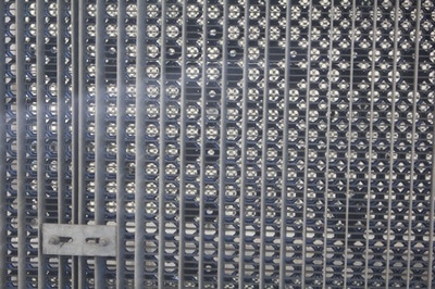
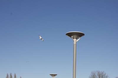
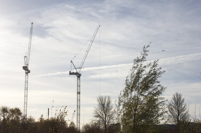
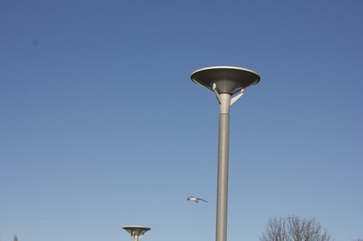
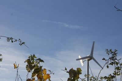
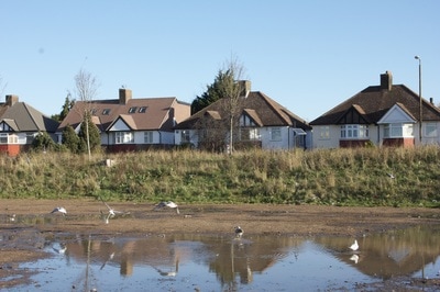
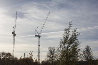
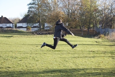
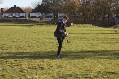
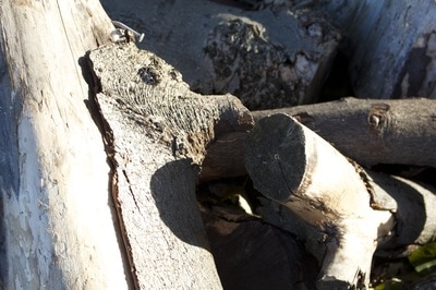
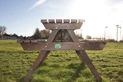
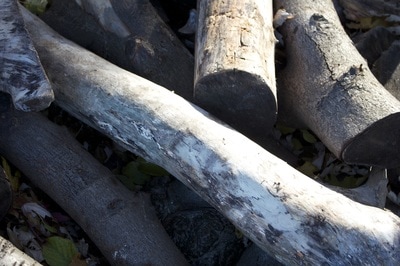
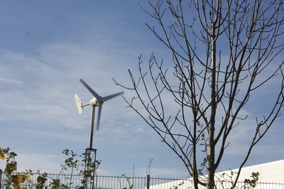
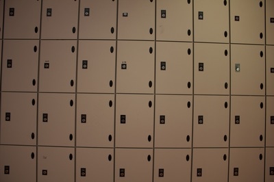
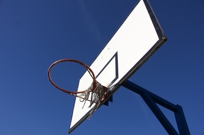
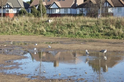
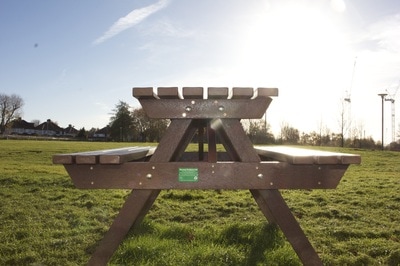
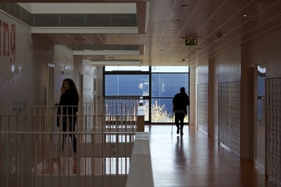
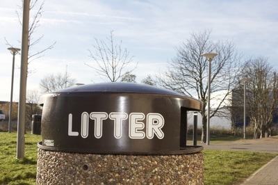
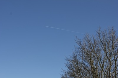
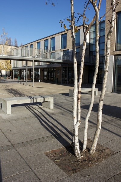
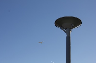
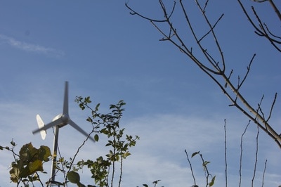
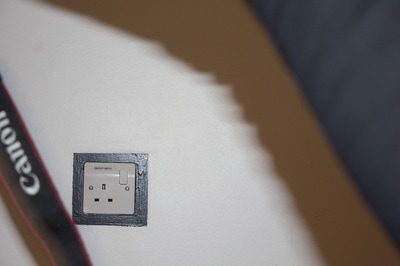
The images below were all taken within the school grounds where it can actually be quite challenging to find something different or interesting to photograph that someone else hasn't already because so many photographs are taken here, however I believe that my images were quite successful and actually different to images other students have created. The lighting on the day was reallly nice as there were no clouds in the sky meaning that my images came out looking nice and crisp. I was looking for geometrical patterns and shapes to take photos of, whilst also experimenting with the negative space that the sky had to offer, and I think that my images came out looking really nice. It would have been nice to have some texture in the sky through some light clouds however this wasnt really a problem.

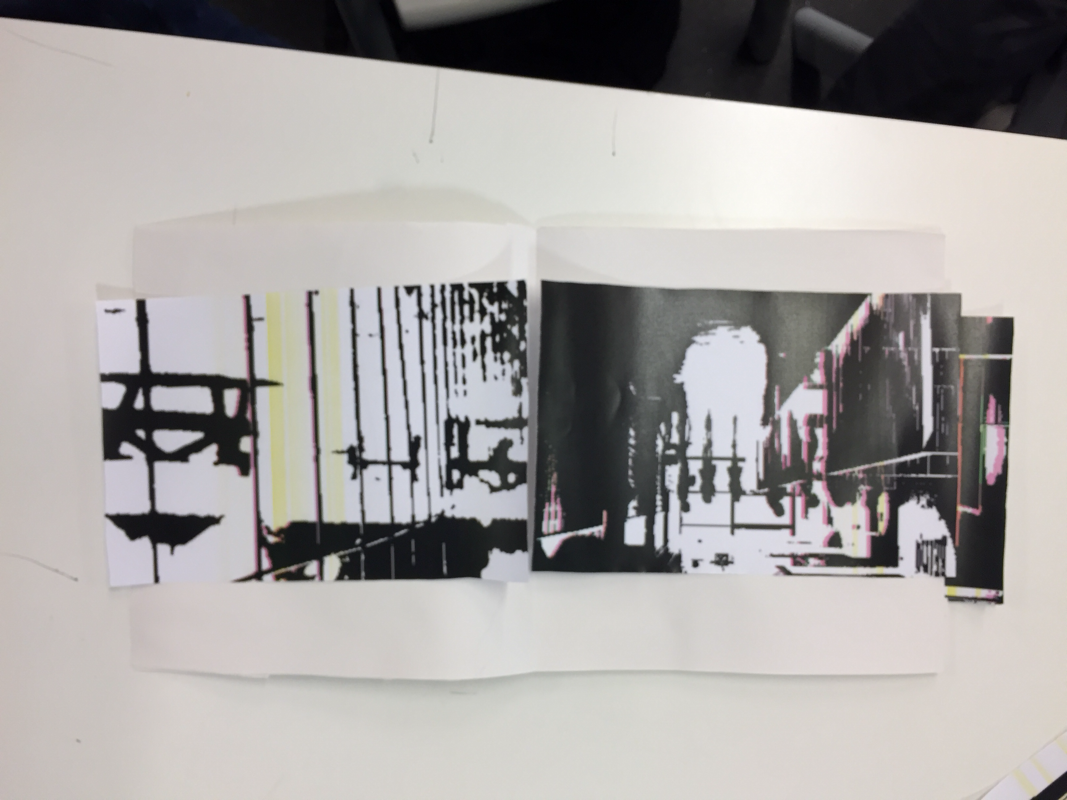
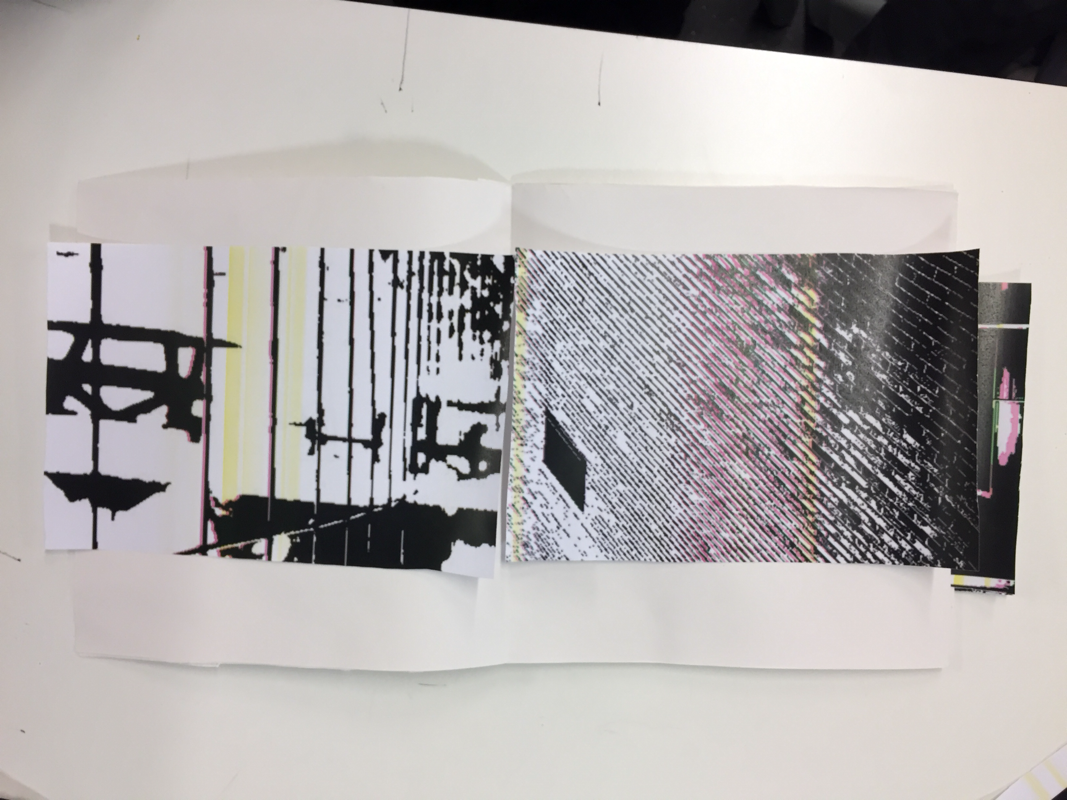
diptych experimentation
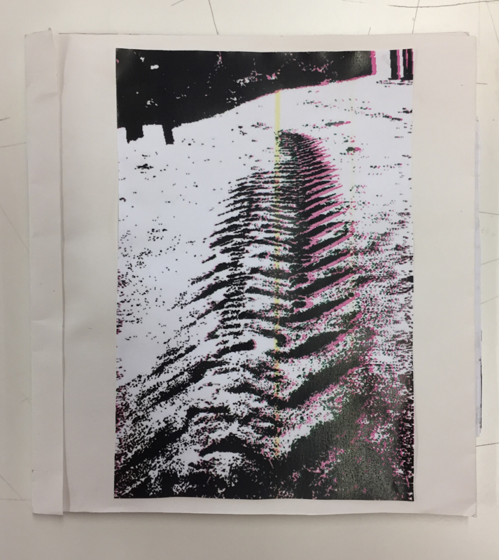
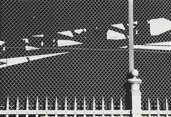
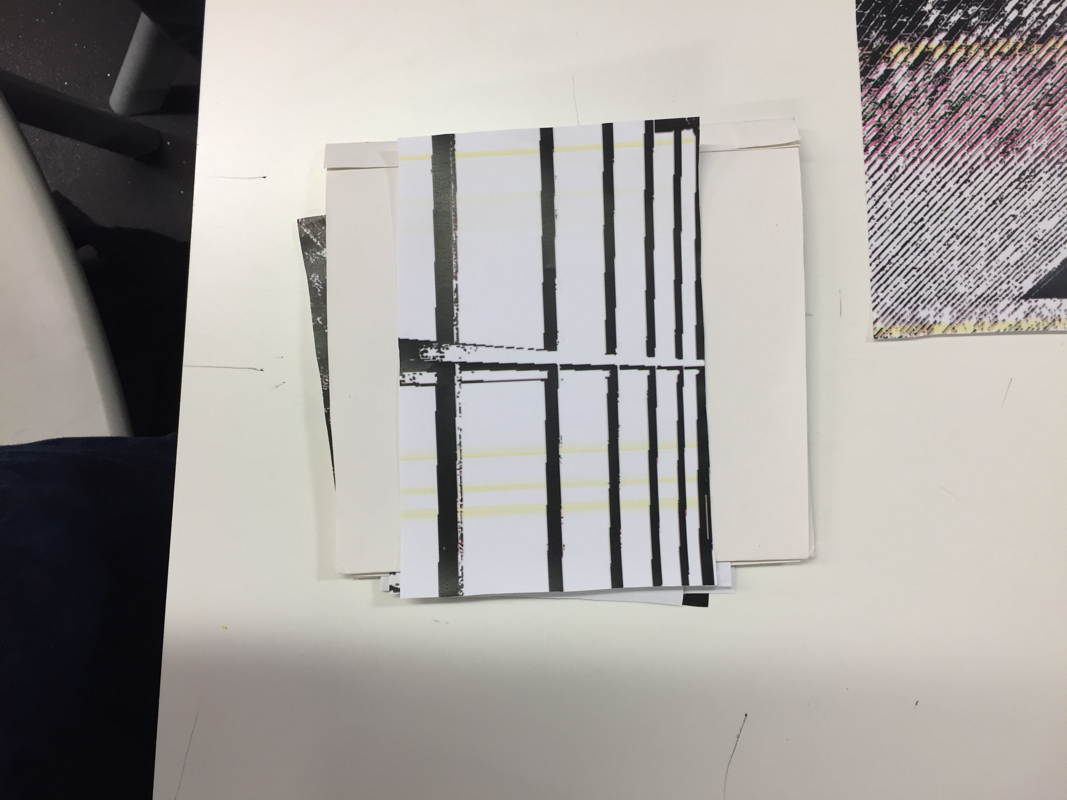
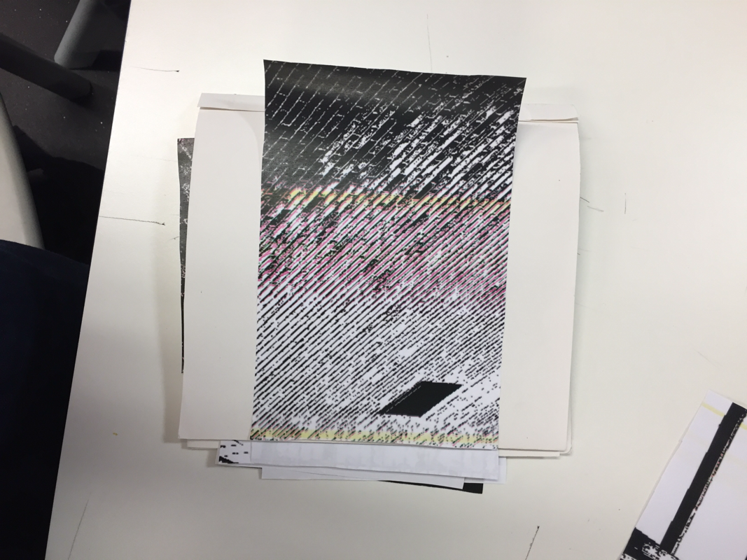
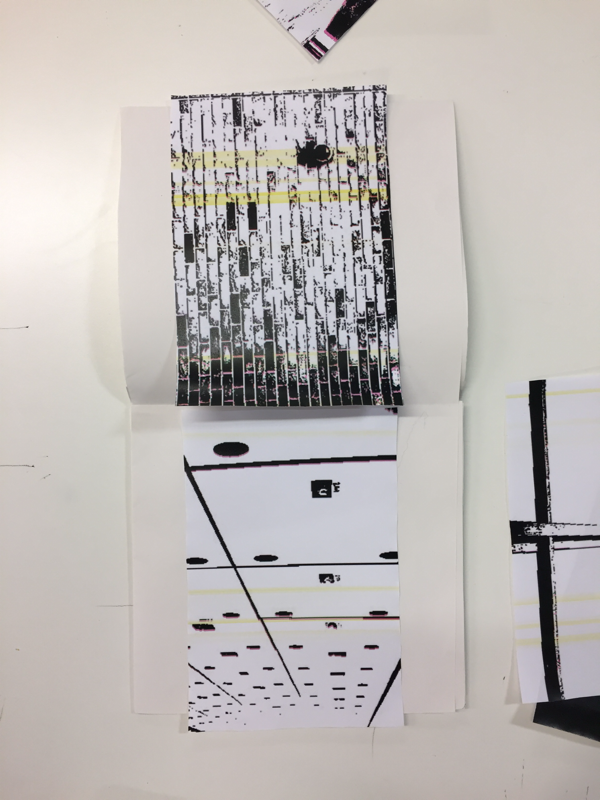
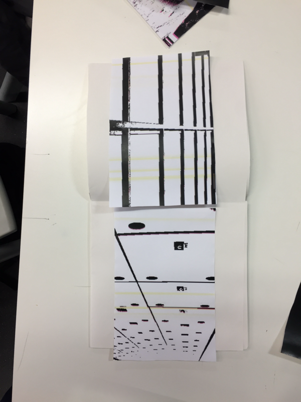
Below are all of the diptych combinations that I tried before I made a final conclusion on the diptychs I was going to use. I did this by placing various images next to each other in the book, testing an image alongside various other images to find the best result, the photos below are not all of the possible combinations becuase there would be way too many possible combinations to realistically photograph, so they're ones that I think worked well, just not well enough to make it in to the final book. I was looking for either strong similarities or strong differences in shape, line, composition, geometry etc.
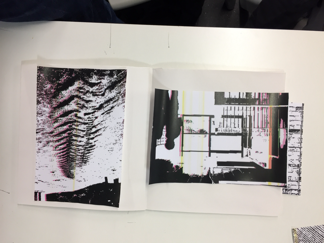
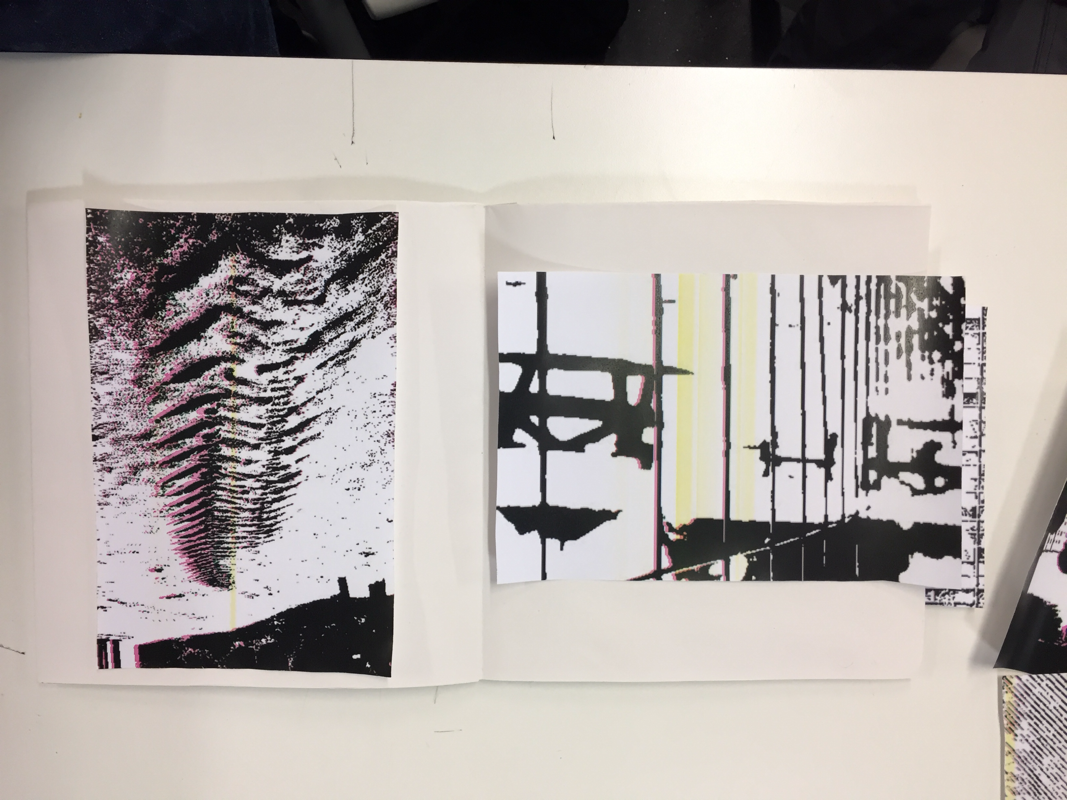
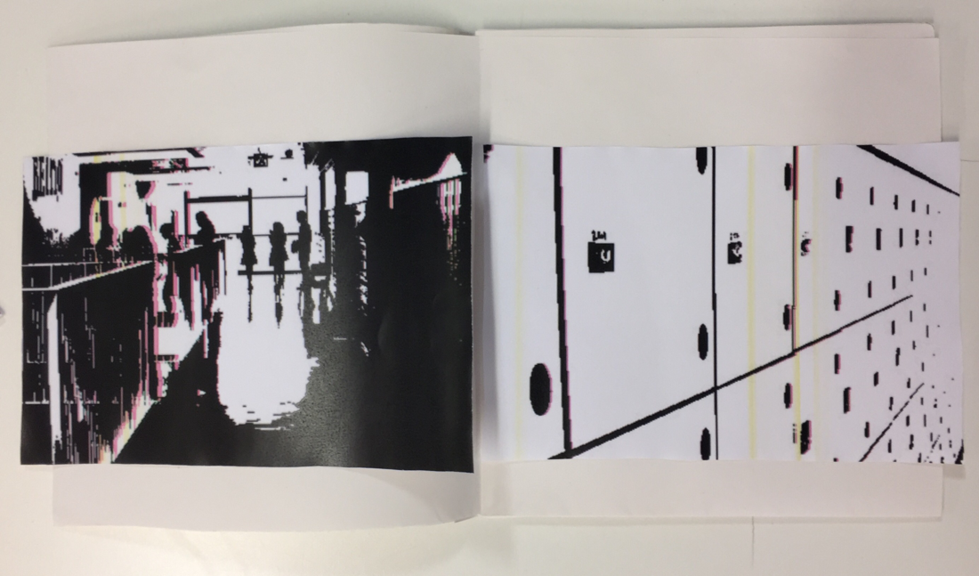
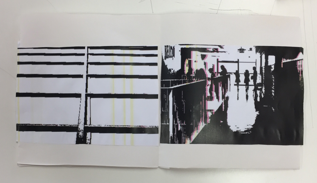
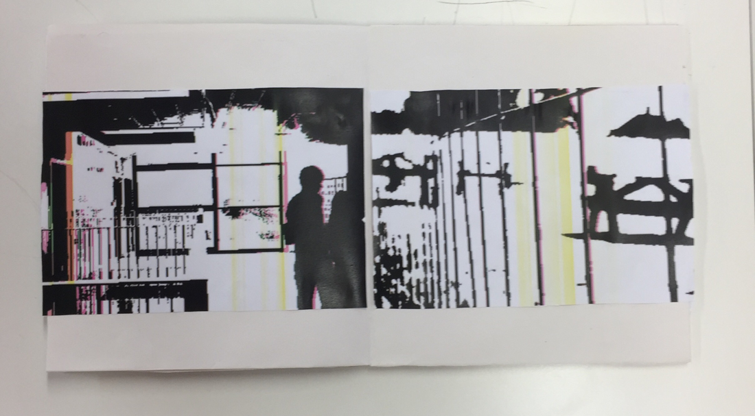
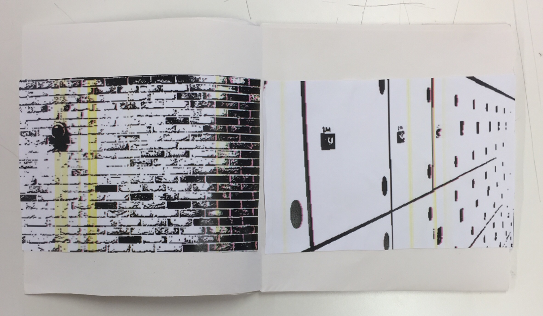
Below are images of the final diptychs that I ended up choosing for my book as I think they worked the best. I gave a variation between whole page spreads and having two images on two pages etc, I also played with the amount of negative space around the images themselves as I found out that it does effect the way an image feels, because of this I ended up printing out the images in various different sizes to achieve the negative space that i wanted for my images to look the best from my point of view. Some of the images have actually been turned around on to their sides like the first image which has actually been rotated for effect.